As Associate Professor at Art Center in Pasadena Tyrone Drake is actively pushing cultural standards of type and typography. Prior to being accepted to the ArtCenter College of Design graphic design program in the mid ’90s he took studied design at other schools, where where he was introduced to typography and lettering. “I had some good professors who opened my eyes to the importance of typographic anatomy, form and the role typography played in communicating information, but it wasn’t until I got to ArtCenter that I began to have deep dives into the history and practice of typography, letterform and graphic design,” he says in our interview. “I didn’t know shit about the Bauhaus and Swiss typography before coming to ArtCenter.”
His first typography teacher at ArtCenter was Basel-trained Leah Hoffmitz, after whose death the Hoffmitz Milken Center for Typography was named. She was instrumental in helping Drake understand the craft of typography and the minutia of letterforms.
“It wasn’t until I was introduced to more experimental designers like Neville Brody, Johnathan Barnbrook, Vaughn Oliver, Chris Ashworth and, of course, David Carson, that I got super excited about typography and graphic design,” adds Drake. “Their way of seeing and expressing words and images through manipulation and distortion, and the new graphic language they were creating, felt more free, organic, and less constrained by tradition that really resonated with me”.
Impressed by Drake’s interpretation of these influential designers, I recently asked him to explain how far he goes in his personal practice and teaching of 21st century typography.


My interest is piqued by a quotation from Henrik Berlewi on your website: “Art must break with the practices of the perfumed, perverse, hypersensitive, hysterical, romantic, individualistic, boudoir-type art of yesterday. It must create a new language of forms, available to all and in harmony with the rhythm of life” (1924). How does this play out in your work?
The portion of that quote that resonates with me is, “It must create a new language of forms, available to all and in harmony with the rhythm of life.” I think bebop, hardbop jazz, and trip-hop from Bristol, England, are the personifications of that idea. When I was in design school, I listened to a lot of Portishead, Massive Attack and Miles Davis. Like Miles, I never liked being confined by cultural standards and the mold of European design methodology I was supposed to fit within. I hated the idea that I needed to design a particular way to be accepted and deemed a “good designer,” but—also like Miles—once I decided to embrace the traditional design methodologies that were being instilled in me, pathways to a new way of seeing things allowed my instinctual sensibilities to mix with those conventional processes. This led to the development of my own graphic voice and consequently allowed my work to grow and mature. In a similar way, I think that’s what happened when Miles began working with producer Gil Evans, who opened Miles up to another way of articulating his sound, resulting in some of the most melodic and romantic jazz recordings ever made, as well as the iconic 26-minute “Sketches of Spain.” Many jazz purists thought Miles sold out, but this new form opened Miles’ music up to a whole new audience.


Do you use or distort or dismantle conventional alphabets (as in the “Resident Evil” series) to teach your viewer a branding language?
As far as my manipulation and/or distortion/deconstruction of typographic form, I guess you can say it’s mostly influenced by the expressive and more Avant-Garde period of graphic design of the mid-to-late ’90s, and the designers whose work I was drawn to when I was in design school at that time—the afore-mentioned Oliver, Brody, Barnbrook, Ashworth and Carson—who were all experimenting and creating their own graphic language with more expressive forms, both typographically and visually.
For me, it’s a combination of the influence of classic typography and forms, sometimes (but not always), with an instinctual need to seek alternative visual applications of that form to help introduce a new visual language based on what I feel is needed for a project and what is being communicated. With the “Resident Evil” project, Netflix gave me space to develop a new graphic language for the title sequence for the live action series after they acquired the IP for the franchise, which has a large following and has been around in various forms, including the original video games, the movie series starring Milla Jovovich, and now the live action series streaming on Netflix.


In aspects of your branding work (Aretha Franklin, for example), you take typefaces into an abstract realm. How does this approach succeed as a branding tool?
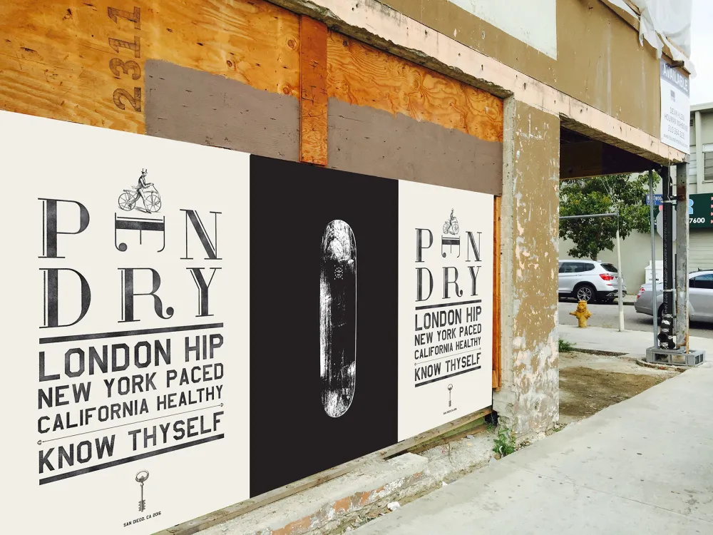
It’s important to say that the most significant lesson I have learned in my design career is differentiating when I’m designing for a particular audience based on client target demographic and brand strategy, such as the Pendry Hotel project, as opposed to designing for my personal projects or branding projects that are more geared towards progressive, secular audiences, such as my music projects, including the Aretha Franklin piece. Based on those parameters, I decide on what is typographically appropriate for the project.


Your Typograms (above) interest me, especially now in this nascent AI period. How do you think AI will impact your type?
The question about AI and typography is an interesting one. As we know, design, and especially typography, are very much influenced by tools of the trade, whether analog or digital, sometimes for better and sometimes for worse. Some designers thrive on emerging media and new digital tools as they relate to typographic form. I have been, and will always be, prone to analog tools because of the humanistic quality and feeling you achieve from using them. This is why I love the work of Chris Ashworth, who still, to this day, uses analog tools in his craft, including press-on type, pen and marker sketches, a photocopier, masking tape, and an X-Acto blade. I recently visited the Jean-Michel Basquiat:King Pleasure show here in Los Angeles and was completely mesmerized by his penmanship and handwriting, which is a powerful presence in most of his work; I was particularly drawn to his use of uppercase letterforms throughout most of the text. It makes you feel like you were sitting in the room with him while he was creating. Absolutely extraordinary.
I’ve never been one to jump on the bandwagon of any new tool that emerges. I prefer to wait and see how it transforms the vocabulary and then gauge how useful it would be to inform my work. However, I do encourage my students in my typography courses to explore the possibilities of using AI as well as new and emerging media tools in their own project solutions.


Typography is an expressive language, and your work pushes conventional boundaries. But what are the boundaries that you set for yourself?
I was fortunate to grow up in a household that embraced personal expression, whether artistically, politically or musically, but absolutely no talking back to adults—the result of doing that was not a pretty one. Personal expression is part of the culture I grew up in and inherent in my personality, informing much of the work I do and how I design. Typically, I don’t set boundaries for myself as far as my approach to using typography and visual language is concerned, but that doesn’t mean that there are no circumstances where I’m bound by design briefs or client brand narrative mandates that have a desired goal for communicating with particular audiences. Still, even then, I seek to explore how far I can push my solution typographically without losing meaning.


Vegas.com was an audacious proposed redesign that bucked the neon conventions of the city.
It’s important to note that the Vegas.com branding project was not a redesign of the lasvegas.com search engine. As a startup, Vegas.com was meant to compete with the already well-known lasvegas.com, a search engine for Las Vegas travel, hotels and entertainment bookings. I was asked to head a creative team to establish the brand identity for Vegas.com, and I was brought in to create a fresh new identity and visual style for this competing search engine targeting younger, hipper, but still affluent and sophisticated thrill-seeking audiences, meant to move away from, as you say, the neon, glitzy, somewhat cliche niche visual identity of lasvegas.com. One of the stakeholders had seen the branding work I did for the Pendry and Roosevelt hotels and wanted the same energy and freshness applied to the Vegas.com brand identity. This included the typography choices, and visual and brand languages. I was encouraged and given the space to create that, and it was well-received. Unfortunately, the project was never realized due to lack of funding.


Would you characterize your approach to type and typography as a hybrid of existing formalisms? Pendry Hotel San Diego has classical syntax combined with minimalist grammar. What is your rationale for creating this brand?
Pendry Hotels is a boutique brand extension of the more upscale resort Montage Hotel brands. The CEO and founder of Pendry Hotels is Michael Fuerstman, son of Allen Furstman, founder and CEO of Montage Hotels. After honing his skills working under his dad for many years at Montage Hotels, Mike was given the opportunity to develop and create his own hotel brand.
Mike’s vision for Pendry was to create a luxury boutique hotel brand targeted to a well-educated, well-traveled, savvy and affluent younger audience, with a lower price point but the same service and quality that the luxury resort Montage Hotels brand is known for. His vision was very much influenced by his travels to London with his dad. He wanted Pendry to evoke a sense of style, sophistication and elegance associated with London, so he coined the term “London Hip, New York Paced, California Healthy.” Working directly with Michael Fuerstman, powering through many lunch and dinner meetings together while discussing his vision, I developed the initial identity for the Pendry brand, starting with the first location in San Diego, CA. Pendry currently has eight locations throughout the US.
The Pendry Brand ID project is an example where I was bound by how the message would be communicated to the end user. The solution called for traditional elegance but with a fresh interpretation and energy of typographic form.
Do you see an evolutionary arc to your work? An aesthetic you are trying to reach? Or is serendipity your preference?
I don’t feel like there’s a particular ethos or design aesthetic that I’m trying to achieve in my work or teaching. I’m intuitive in my approach, although design briefs are quite often an important influence on the final solution or outcome. I will say, however, that I have seen a maturity in my work over the years. For example, if I look at the work I was doing in the late ’90s into the early 2000s, a lot of it was very self-indulgent, even though quite often it was for a client or corporation. Although I still trust my instinct, I’m a lot more practical now about my approach to solving design problems. I don’t have to put as much of my own self-expression into the work for it to be deemed successful. In the classroom, I make it a point to show examples and discuss the early work I was doing that was more self-indulgent as opposed to solutions that were more appropriate to the message that needed to be communicated to the intended audience.
Finally, how do you balance your professional work with your teaching practice?
My professional and teaching practices are inextricably linked. They are extensions of each other, and I love them both equally. Like a musician whose music is in his soul, running my design practice and teaching typography and graphic design are labors of love and have become more of a lifestyle than traditional jobs for me. And they both influence everything I do. I can work all day or all night if I choose to and, quite often, depending on deadlines, that’s exactly what happens. During my days as a student at ArtCenter, one of the most valuable lessons I learned was the value of time management. Although I have the ability to work whenever I want, I have to be cognizant of client project deadlines and my teaching schedule. Sometimes the two overlap, but I still manage.
Can a teacher teach typography and design without being an active practitioner?
I don’t think every good (or even great) designer makes a good teacher. I never had aspirations of teaching graphic design or typography. When I was initially asked to teach a typography course at ArtCenter, I turned the offer down partly because I wasn’t sure I’d be good at it (fear of failure). Then I got some advice from a former instructor of mine who became a very good friend, who told me that my design instinct and way of seeing expressive typographic form would be valuable in the classroom and a challenge for me to teach and influence a new generation of graphic design students. I didn’t start teaching for validation or acclaim of my ability as a designer, although, over my 20-plus years of teaching at ArtCenter, I have garnered recognition for my professional work as well as the student work that comes out of the graphic design and typography courses that I teach. It took me years to find my teaching chops—20 years later, I’m still doing it.
I also don’t think you have to be an active practitioner to teach graphic design or typography; however, I can say that being an active designer myself has certainly benefited me in the classroom because I can use my personal experiences and professional work as examples of the skillsets I’m trying to teach. This happens whether I’m demonstrating the design process, brand identity development, typographic use, graphic and brand language, or the psychology of collaboration with a client. But more important than that is showing examples of mistakes I’ve made in my design career and the lessons learned from those mistakes.


