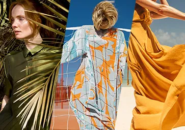
London Fashion Week has come to a close, but don’t worry if you missed the shows. Pantone has helpfully summed things up in a wonderfully descriptive forecast of the colours that will be big in spring 2024.
The colour space company makes the next season sound exciting, telling us that the season’s colours will “stretch the imagination and bring expressive beauty to the everyday” due to “divergent consumer demands for colour to implicitly reflect their individuality and showcase their identity”. That might sound like an excuse to avoid making concrete predictions, but no; it’s forecasting that we’ll be expressing our individuality and identity in ten particular shades (see our guide to colour theory and colour in branding to learn how to use them).

Pantone’s colour picks for London Fashion Week include “energising brights, nature-based shades and more classic heritage tones steeped in history and tradition, providing a self-made layered collage of experimental creativity.”
Want to know the colours? Patience. Leatrice Eiseman, executive director of the Pantone Color Institute, says: “Both respectfully considered and hyper personal, this season’s colours move beyond the predictable to interact with each other in powerful ways. Drawn from daydreams of simpler times and at the same time showcasing contemporary modernity, a palette of colour where our unfettered desire for freedom and authenticity sets the rules and personal style comes without limits.”

Just tell me the colours, already! OK, OK, enough of the deep preamble. Pantone’s ten colours for London Fashion Week include two shades of blue. There’s ‘Horizon Blue’, described as “an atmospheric blue hue denoting where the sea meets the sky” and ‘Strong Blue’, a blue that “encourages us to look beyond the obvious”.
They’re complemented by ‘Bistro Green’ (a “hearty deep green tone with a substantial presence”), the pungent ‘Spicy Mustard’, the savoury earthy brown of ‘Chutney’, ‘Sun Orange’, ‘Fiesta’ (a fiery and impassioned red that “conveys a celebration of life”. ‘Charlock’ (a pale green-yellow) and ‘Burnished Lilac’ (a “tinged and smoky lavender tone with a new sophistication). Finally, there’s ‘Tarragon’ a “fresh green infused with notes of citrus, which displays a delicate piquancy”.
I don’t know about you, but I’ll be using them with abandon to unleash my unfettered desire for freedom and authenticity in a self-made layered collage of experimental creativity. You can learn more in the Pantone London Fashion Week report. It’s a shame that Apple didn’t hold fire before deciding on its much-mocked iPhone 15 colours, which turn out to be way off trend.


