Business cards aren’t so much “cards” as they are portable advertisements with built-in calls-to-action. Improving your business card design means improving your business. As we move into the new year, we’re seeing brands experiment with explosive new designs that reinvent what those little rectangles can do. So without any more ado, here are 8 dazzling business card trends for 2022 that are sure to set you up as a modern, cutting-edge professional.
Here are the 8 most eye-catching business card trends of 2022
—
- Cards that speak for you
- Anti-cards
- Read between the elements
- Wrapped around your little card
- Modern-day modernism
- Pattern extensions
- Softie styles glow up
- Turn up the contrast
1. Cards that speak for you
—
Where once business cards were “strictly business,” lately they’ve become more… chatty. Perhaps it’s part of the greater trend towards personalizing interactions, or perhaps it’s because we’re all just starved for casual conversation after the last couple of years.

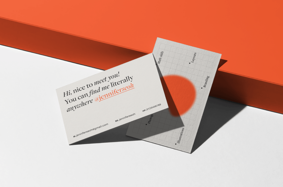
Even formal industries can use their business card design to showcase a more human side, with in-card text that reads like idle chit-chat. The idea is to come across as friendly and personable by including text that reads like a personal conversation.
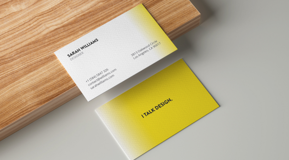
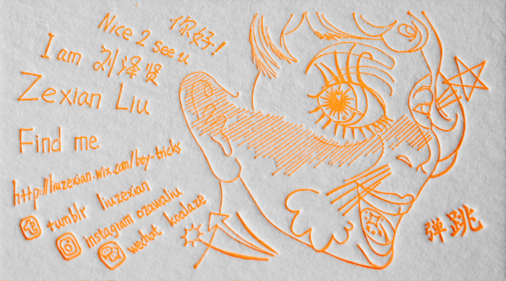
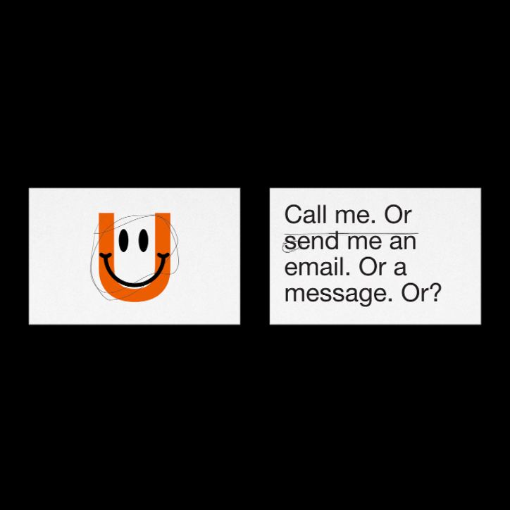
Messages can be longer and more meaningful, like designer Jennifer Seoh’s card above, or just a simple but noticeable “hello!” like Awesome Designing’s example, also above. Don’t forget to use the font that best matches the tone you’re going for.
2. Anti-cards
—
In general, we’re seeing a lot of long-standing traditions being challenged lately, and those kinds of wide-reaching movements tend to bleed over into graphic design, even business card trends. It’s easy enough to see looking at one of the most prevalent business card trends of 2022: the anti-card.
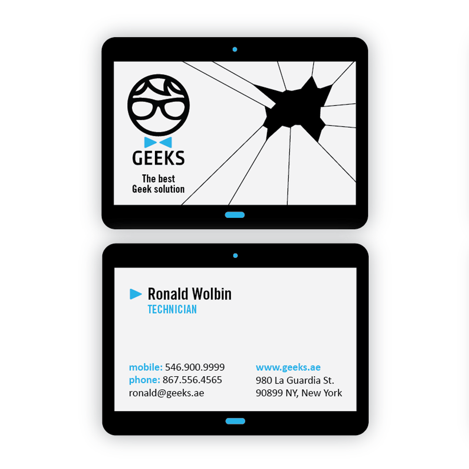


An anti-card is a card that isn’t. These cards are designed half for irony, half to stand out, and all for showing off your creativity. They usually involve some kind of visual pun related to the person’s industry, like green in blue’s library card above for a tutor, or a self-referential joke, like the poor soul trapped in Ellis Pearce’s card design below.
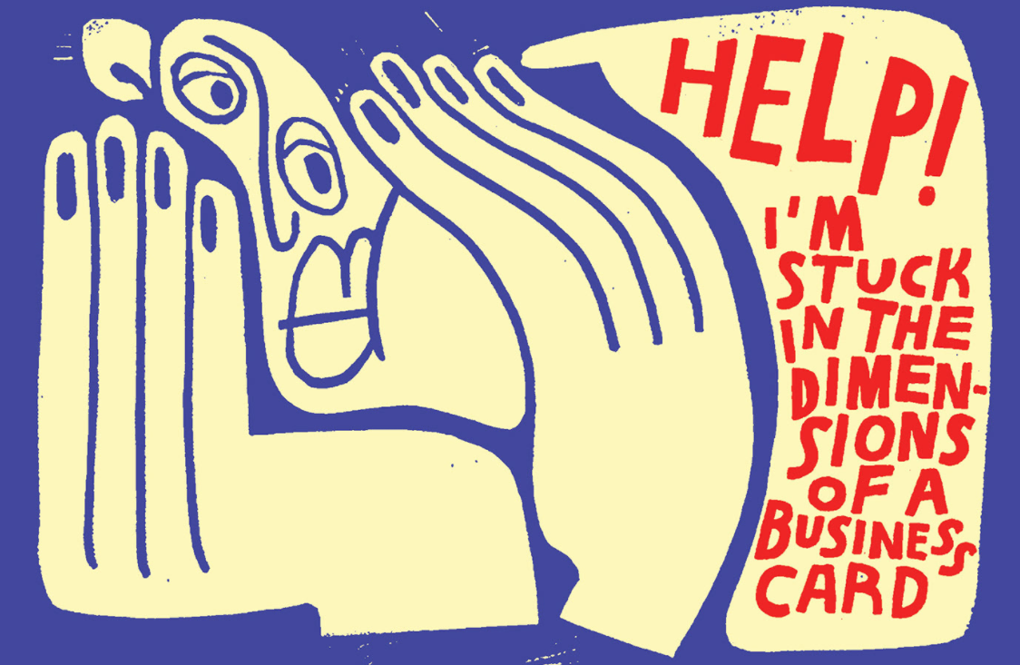
Self-referential jokes and all other meta-humor are more popular than ever, especially among younger people. Acknowledging the inherent absurdity in business cards is a good way to connect with forward-thinking audiences and prove your authenticity. At the very least, you stand out from the more rigid and humorless business cards out there.
3. Read between the elements
—
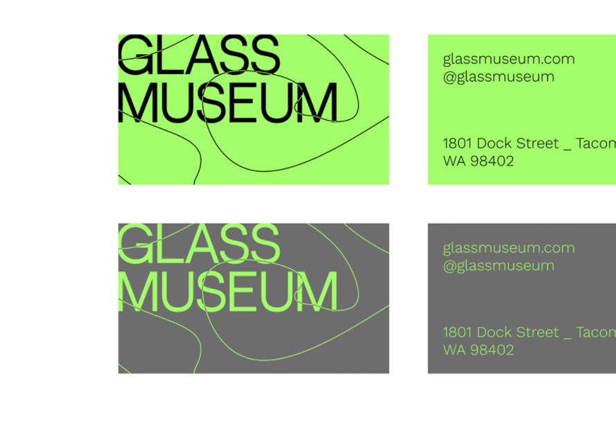
If you like how anti-cards break the rules but still want something more serious and professional, another big 2022 business card trend is the blending of design elements with text elements. Where the art ends and the words begin, only the designer knows for sure.
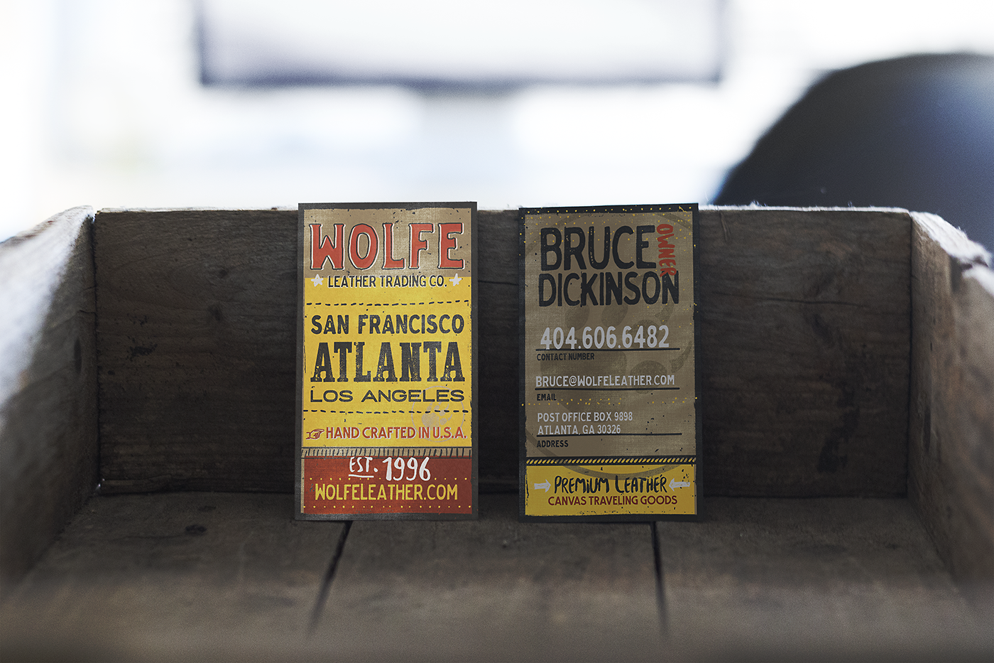
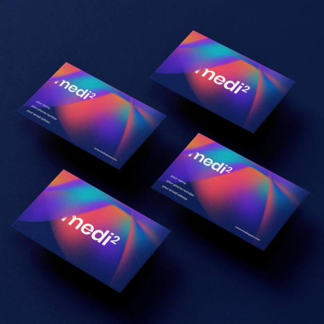
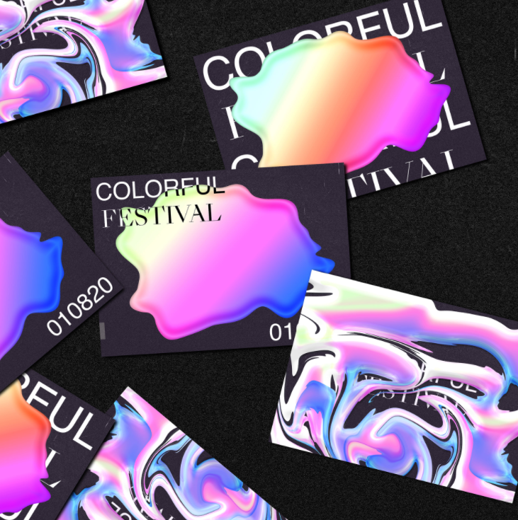
This trend works great for giving your card a visual pizzazz that makes it more memorable, but without going too far off-center. You’re able to show off your artistic side without sacrificing the legibility of your contact information—the best of both worlds!

4. Wrapped around your little card
—
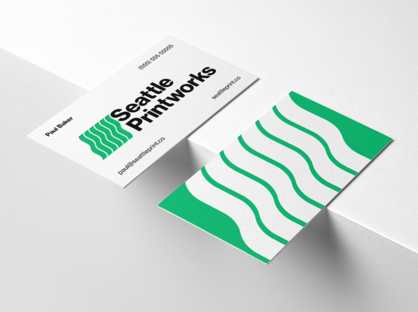
Although this particular business card trend isn’t new, we have been seeing it a lot more lately. It entails wrapping an image around the back and front of the card, as if it poured over from one side to the next. This makes the card feel more interactive and engaging when a person turns it over in their hand.


This trend pairs quite nicely with the others here that eschew the traditional rules for business card design. The cut-off visuals come across as edgy and modern as well, giving the whole look an extra sophistication. The best part is it works equally well with both serious and playful brands.


5. Modern-day modernism
—
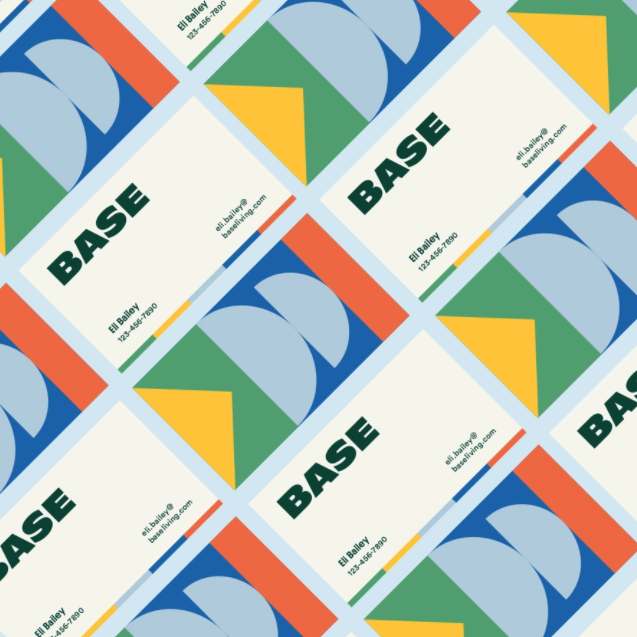
The modernist design styles of the mid-1900s are making a comeback, at least on business cards. When you stop to think about it, the design elements are a perfect fit for business cards: they’re attention-grabbing, good for reading, memorable, and easily compacted.


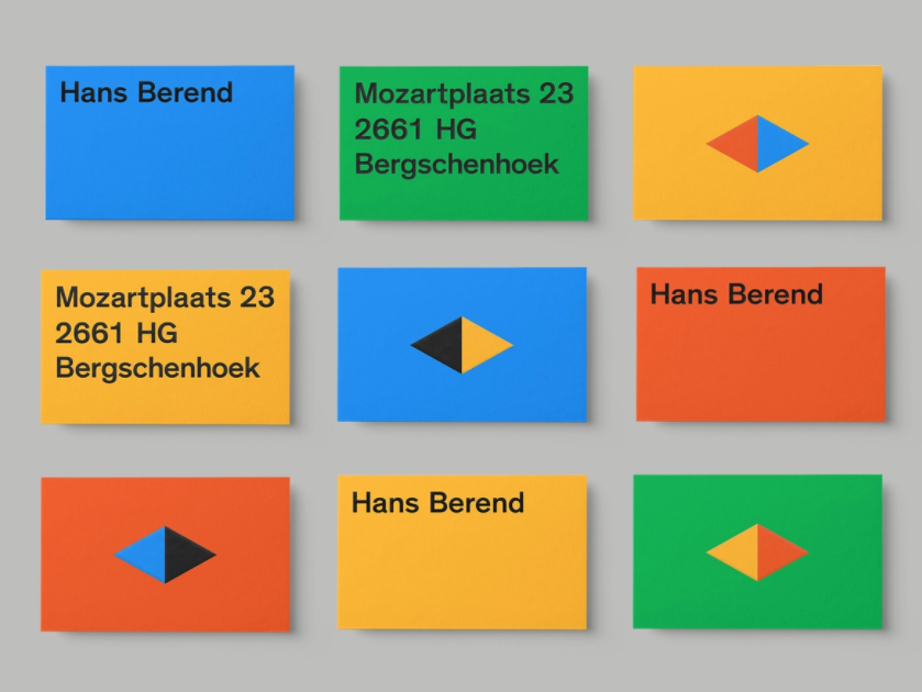
Modernist design upholds that “form follows function,” or that visuals prioritize the rational purpose of the subject—in this case, business cards—over creative expression. The elements of modernism that we’re seeing on business card trends this year involve primary colors, basic shapes like circles and triangles, and strict grids like in nechu’s example below. Last but not least, the style is famous for its bold, sans serif fonts, which translate perfectly to pocket-sized cards.
6. Pattern extensions
—
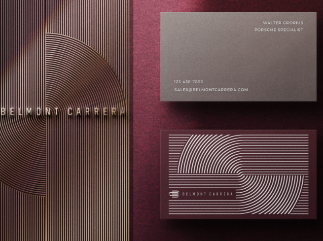
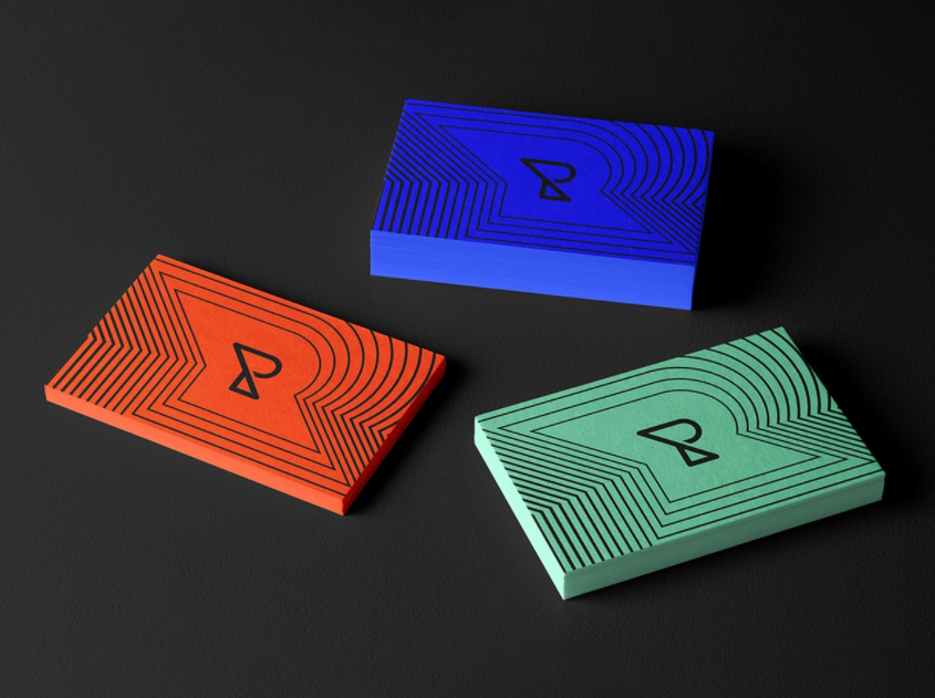
While repeated patterns have always been a popular business card trend, in 2022 we’re specifically seeing patterned line art. You’d think that accountant you just met was handing you some Joy Division cover art.
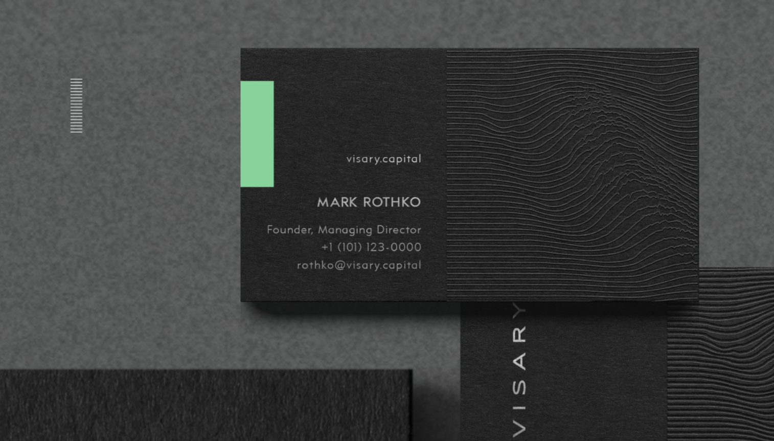

Like a few of our other business card trends, this one also shows a deviation from custom. Simultaneously nostalgic and modern, line art has an inherent edginess to it, especially the erratic and chaotic ones set against black backgrounds. More traditional businesses can temper this effect by using curves, like the Monochromatic Institute example, or bright colors, like the Kevin Craft example, below.
 , via Dribbble
7. Softie styles glow up
—
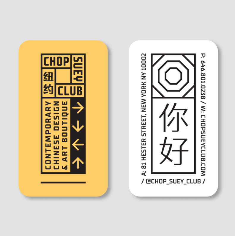
Originating from the work of legendary graffiti artist Phase 2, bubble letters are often associated with the design styles of the 1970s. Originally coined softie styles, these fonts are majorly in this year with some aesthetic modifications and their ultra-bright coloring.
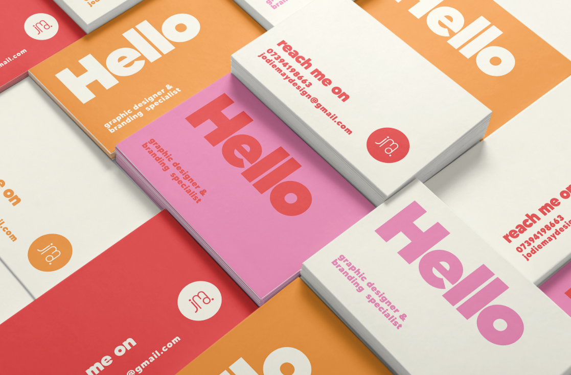

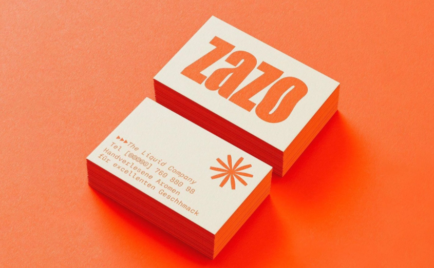
The first noticeable difference between bubble letters then and now is that the current iteration is a lot less soft. Softie styles today have more straight lines and sharp corners than their 70s progenitor, perhaps inspired by the stark, bold fonts of the minimalist movement from the 2010s.
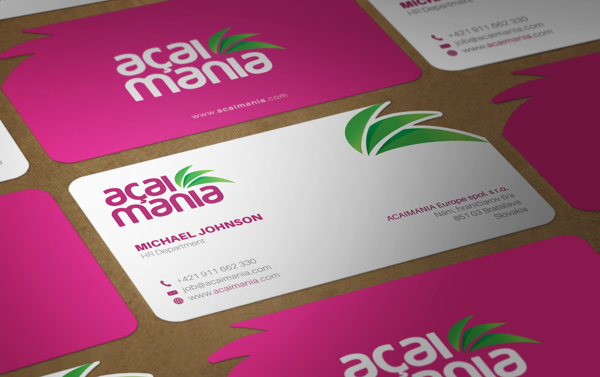
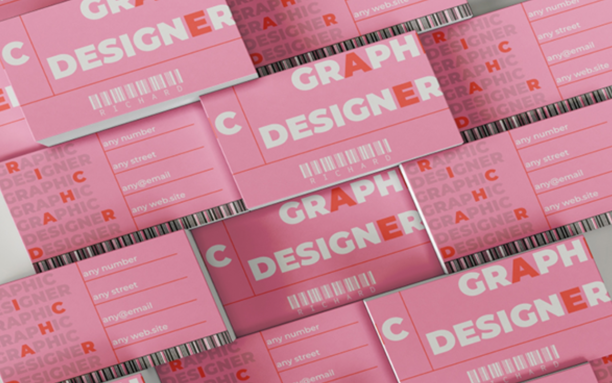
Still, the thick typeface stands out now as it did then, highlighting keywords and aiding legibility on small-scale cards. When coupled with bright colors, they lend a retro or nostalgic feel to designs that mix old with new.
8. Turn up the contrast
—
Last, and by far our most popular business card trend for 2022, is cards with high contrast, both in colors and typography.

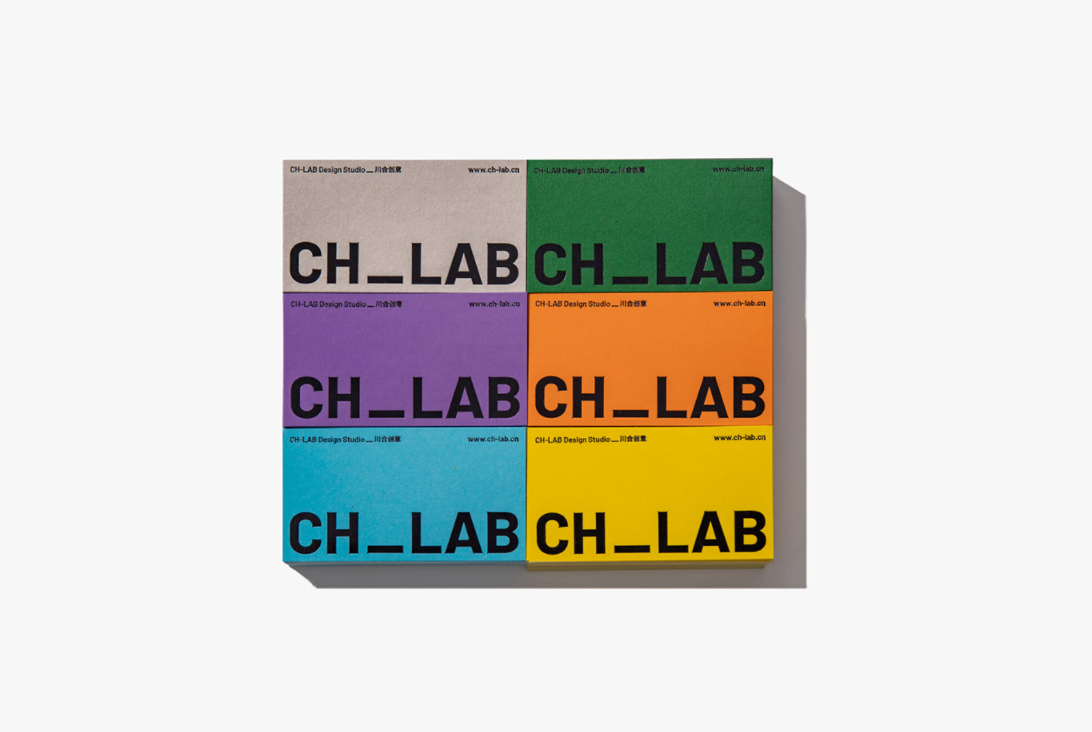
You’ve already seen this trend a few times already by looking at the other examples. The high-contrast trend underpins many of the other trends, accenting their strong points and mitigating their weaknesses. In other words, it’s a great trend to combine with other business card trends on our list.

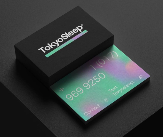
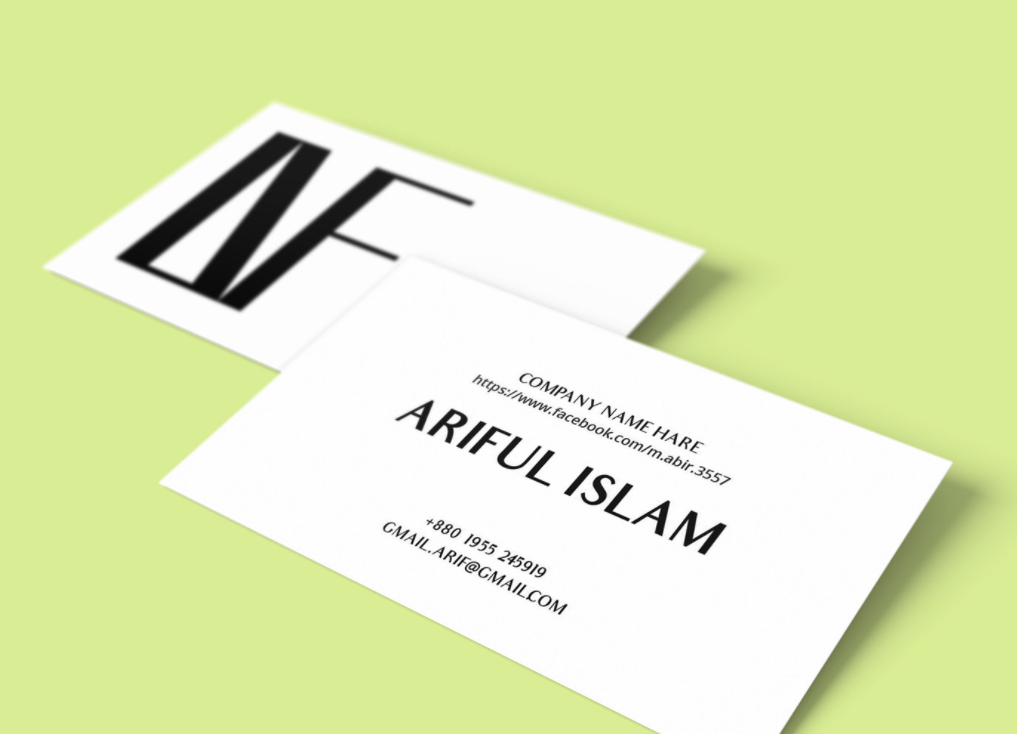
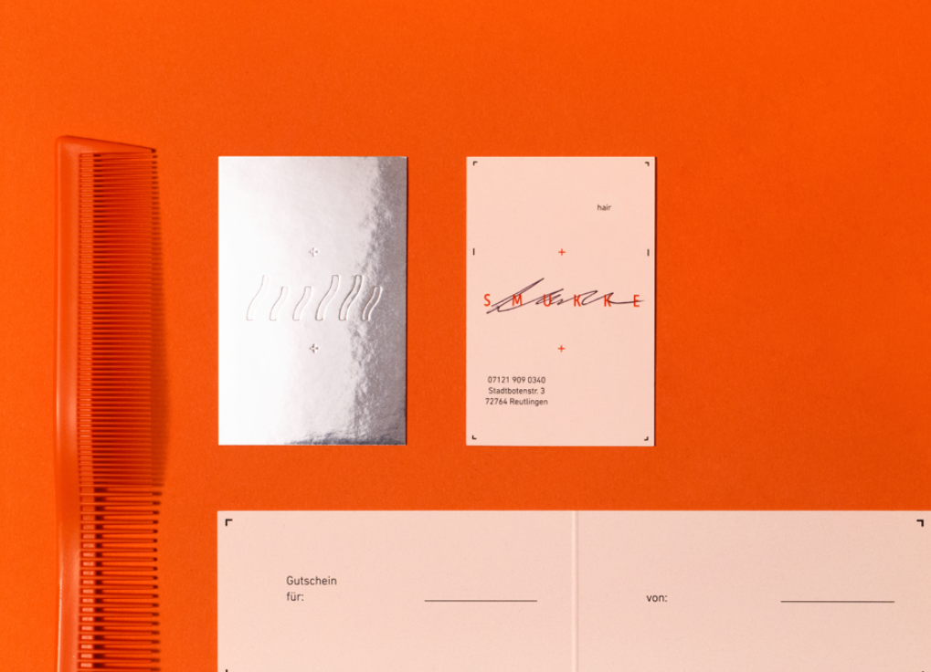
A lot of the cards you see will take a black background and add flourishes of a bright color. That’s a good start, but to take full advantage of this trend, you can also contrast the size of elements, especially typography. Pairing big lettering with small lettering creates a dynamic effect that makes your card look more interesting, plus it allows you to influence how the reader interprets your brand by emphasizing certain words over others.
A little representation of you
—
The bare minimum of business cards is to make it easy for people to contact you, but they can do so much more. As a branding tool, your business card can have a lasting effect of what people think of you, especially if it’s your first impression.
It’s not enough to just throw together the latest business card trends and call it a day. The key is to choose only the trends that you and your brand identifies with. Are you a retro-techno line art kind of brand, or maybe a brightly-colored, bubbly letter kind of brand? The design choices you make on your business card signal what kind of person you are, so choose carefully.


