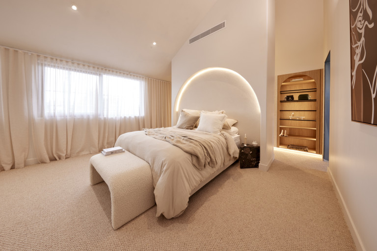
The Blockheads went all out to create the perfect master bedroom retreat this week, with spacious rooms featuring luxurious walk-in wardrobes, separate relaxation areas, reading nooks, make-up stations and more.
It was a tough week for the judges but now at the halfway point of the build, one team took things to the next level with an almost perfect score. And I have to admit I’m in agreement that Steph and Gian’s had the X factor. Read on for more comments, scores, pictures and where to shop the look.
Kyle and Leslie (Fifth place)
With a consistent aesthetic and excellent craftsmanship, the judges agreed Kyle and Leslie’s master bedroom matches the house they have created… but worried about its practicality. From the harsh texture in the recessed bedhead arch to the LED downlights directly overhead and artwork that reminded Darren of a chocolate shop, they were concerned style had been chosen over function. No dedicated make-up and dressing station for example was a missed opportunity, Shaynna said.

The couple need to think: “more about what is liveable and not simply Instagrammable,” Marty added. It’s a room that will appeal to some, Shayna summed up, but going forward, more thought was needed. Shaynna made some good points: you need lamps or pendant lights in a master bedroom and bedsides big enough to fit at least a book on!


SHOP THE LOOK: Cognac framed print, $249 | Necoco side table, $299
Leah and Ash (Third place)
“How good is that scalloped ceiling?” gushed Marty as he walked into House 2’s master suite. “And in a week!” Shaynna added… but the compliments soon ran out. The curved bench seat at the window with floor to ceiling sheers and the Palm Springs inspired artwork against a muted but consistent colour palette worked, the judges agreed, but some styling choices seemed there just to be eclectic and basic design points were missed.

More furniture was needed, the lack of shoe storage was a problem and overall the plan could have been tweaked to make better use of that stunning ceiling and natural light, they decided.

The dressing room/walk-in was all a bit much for me too.

SHOP THE LOOK: Blue ikat rug, $2049
Kristy and Brett (Second place).
“Simpler and more impactful,” Darren said as he walked into Kristy and Brett’s bedroom, admiring the warm colour palette, the Venetian plaster wall finish, a “sensational” bedhead and rug and even an ottoman for dressing. It was a room that “gave you a hug” Marty kicked in, with Shaynna saying it was the best floor plan she had seen so far. Laying in the bed to watch the stars through the skylights above, enjoying the warmth of the fireplace would be heaven, they agreed, with Marty saying the whole space was “well furnished, well designed and really well executed.” If only, Darren added, the bedside tables were bigger!

What was going on with bedsides, or lack thereof, this week?!

The walk-in got great comments too, leaving Shaynna saying she felt uplifted!

SHOP THE LOOK: Hakon side table, $329
Steph and Gian (First place) 29/30
Walking into Steph and Gian’s master wing, the first thing to hit the judges was the huge walk-in wardrobe and dressing area. With a marble-topped island, Hafele accessories, and enough storage even for Shaynna, this screamed luxury. “This wardrobe could be in a $20 million home,” Marty said… a room you use to get ready to go out and then don’t want to leave!

But as impressed as they already were, the bedroom took their breath away. “This is HOT!” Shaynna said, admiring everything from the lighting plan to the neutral palette, the layout, styling and more. With only the bedside tables earning a frown (not big enough again, Darren said) this was a near perfect room.

Shaynna said Steph’s eye was incredible, especially as she was only 27.

SHOP THE LOOK: Lola large ottoman, $811 | The Zenn Design Soho oversized king bed, $4296
Eliza and Liberty (Fourth place)
With double-glazed windows and a fireplace to keep things warm, Eliza and Liberty had created a cosy, beautiful room, but one that perhaps needed more. Simple, perhaps to the point of too little happening, the judges were concerned the pair had been overwhelmed this week, pointing to incomplete paint, sparse styling and artworks that favoured one side of the room but not the other.

The layout worked well – particularly in the wardrobes – and the colour choice was perfect for a bedroom, but with a definite sense of desperation and some choices that seemed to clash, more time should have been found. Marty said however, that their great floorplan and layout was more important than any styling or painting fails.


SHOP THE LOOK: Addison occasional chair, $1005
Photography by David Cook via The Block Shop and nine now.


