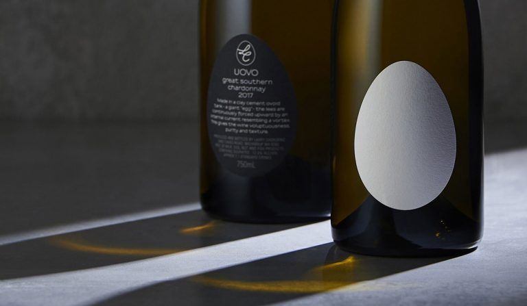
A bit different, this one, featured more for the symbolism on the label than for the Uovo wordmark. That said, I imagine that when the shopper sees the bottle, the egg-adorned label could be considered a form of logo (a visual emblem, at least).
Spotted while browsing the Denomination website, and thought it worth sharing.
Here’s what Denomination say in their portfolio.
“When winemaker Larry Cherubino had three giant concrete ‘egg’ tanks delivered to his winery, he knew the packaging [and Uovo logo] had to reflect this revolutionary way of maturing wine. Wine made within the ovoid shape is purer than anything achieved traditionally, as the lees [the sediment of wine in the barrel] are continuously forced upward by a naturally occurring vortex, creating wines with a purity and texture that is unsurpassed. Named ‘Uovo’ (egg in Italian) Cherubino wanted the packaging to reflect the unique hand-made winemaking process and delicate nature of the wines.”


