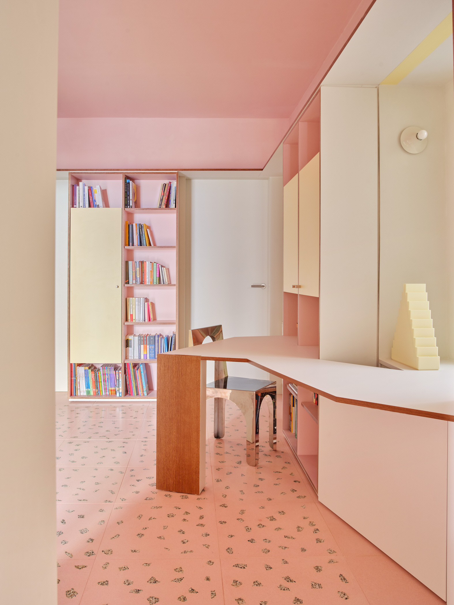
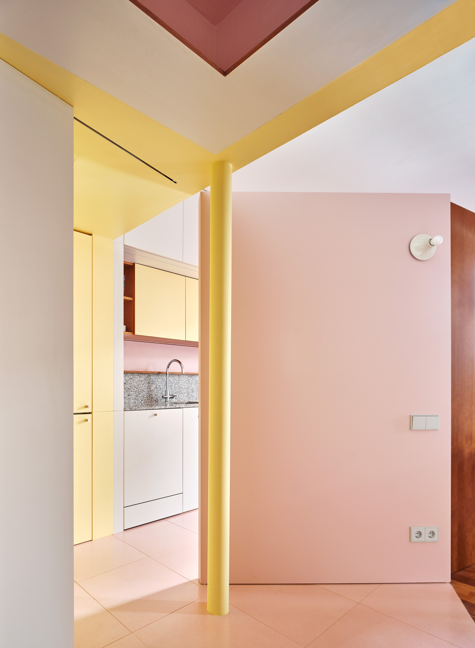
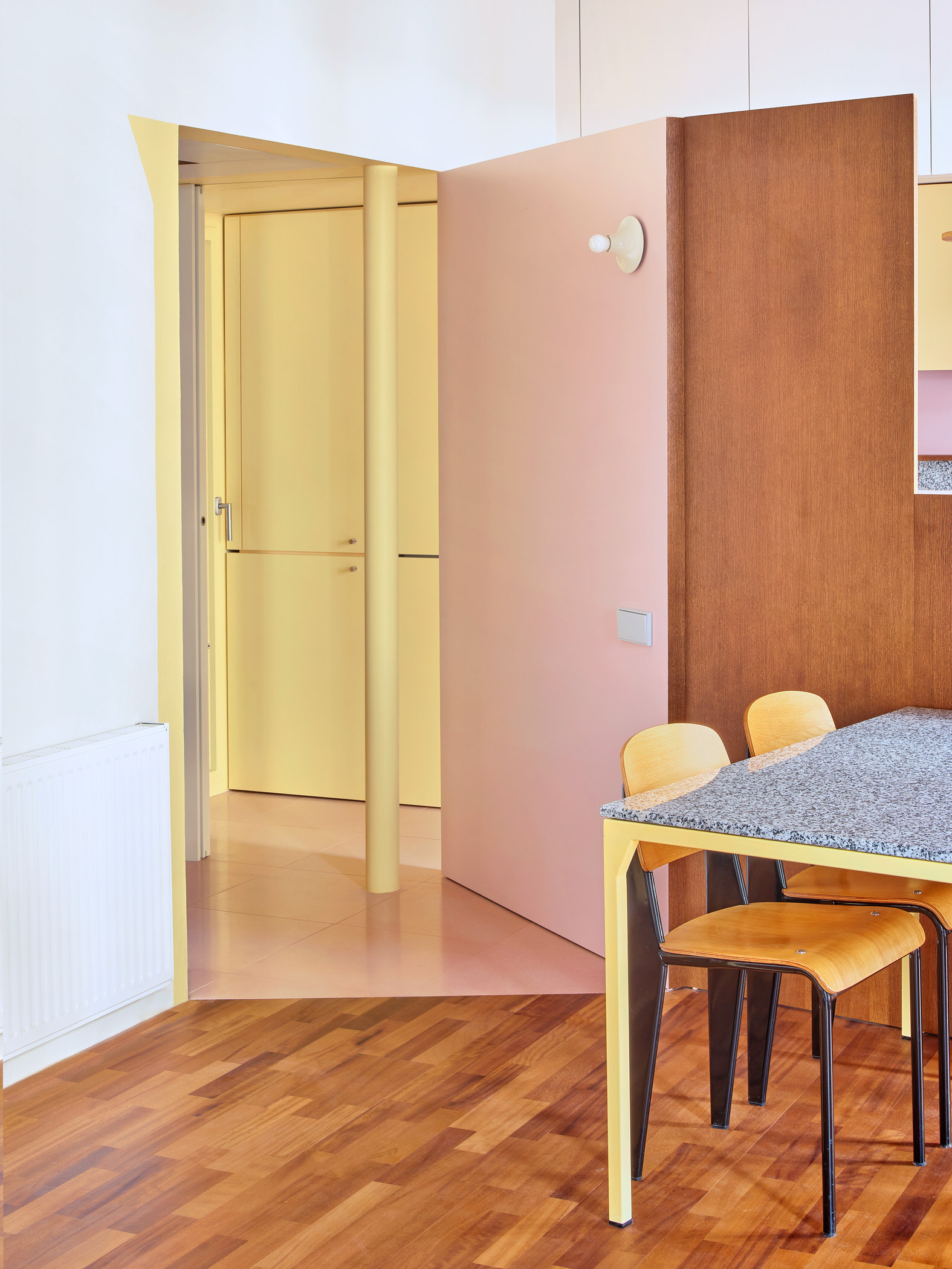
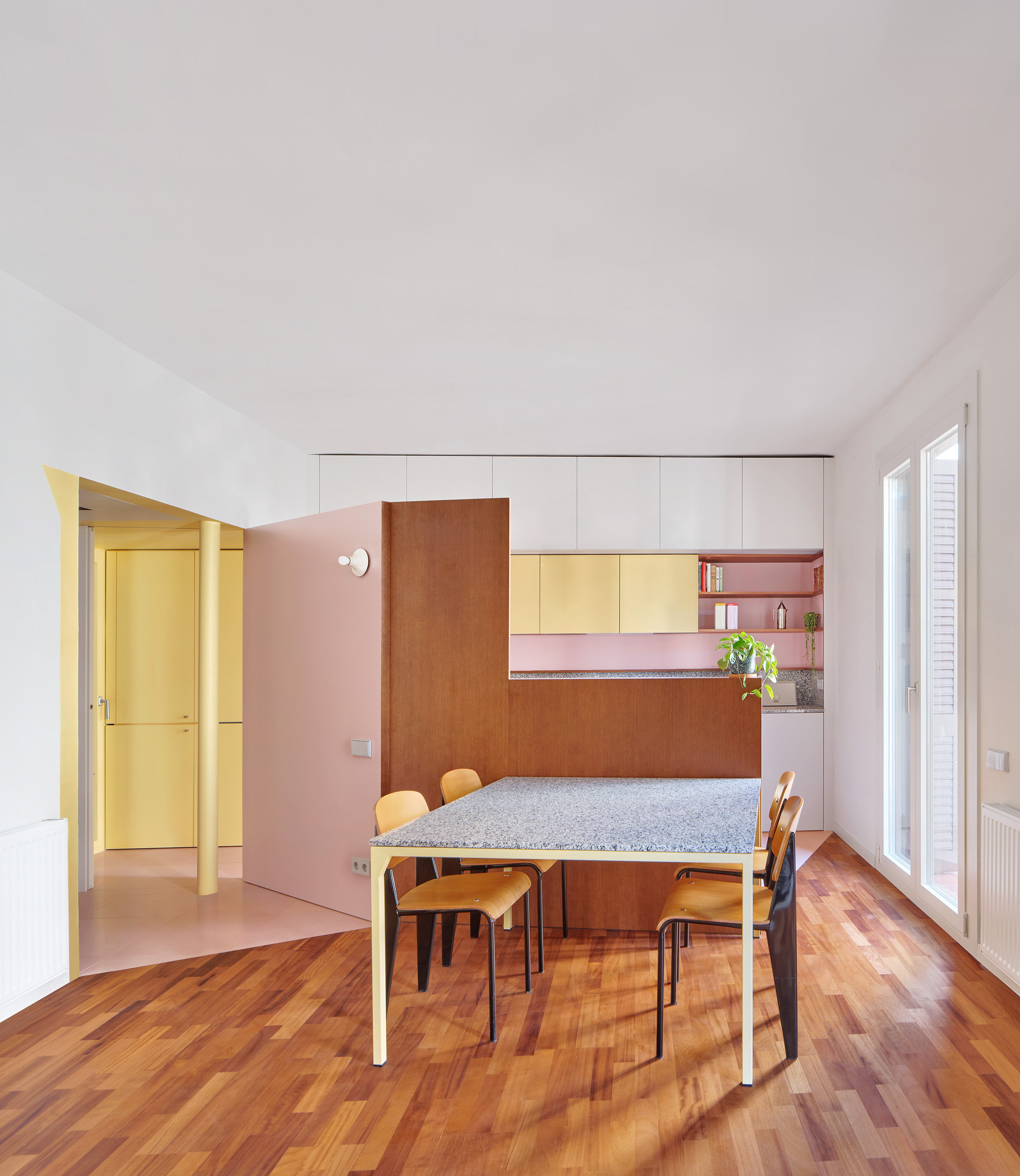
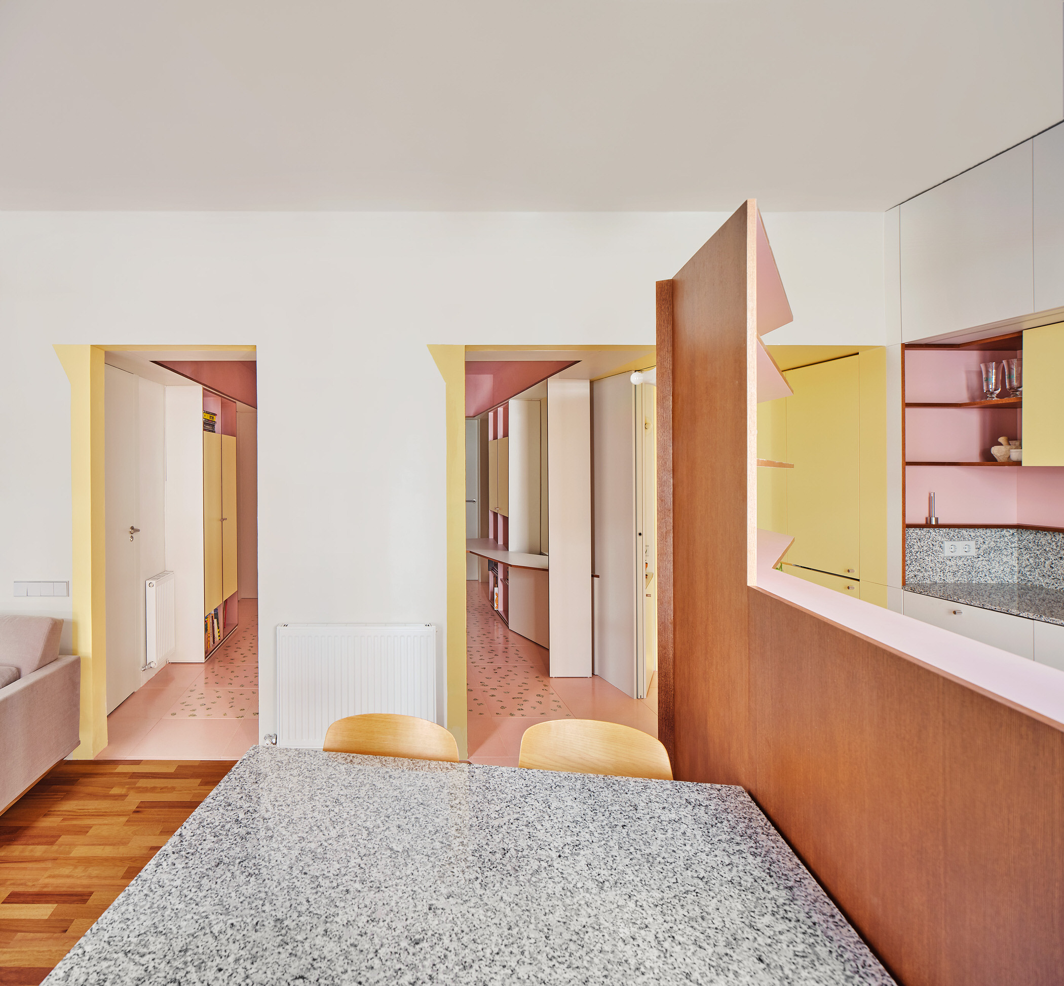
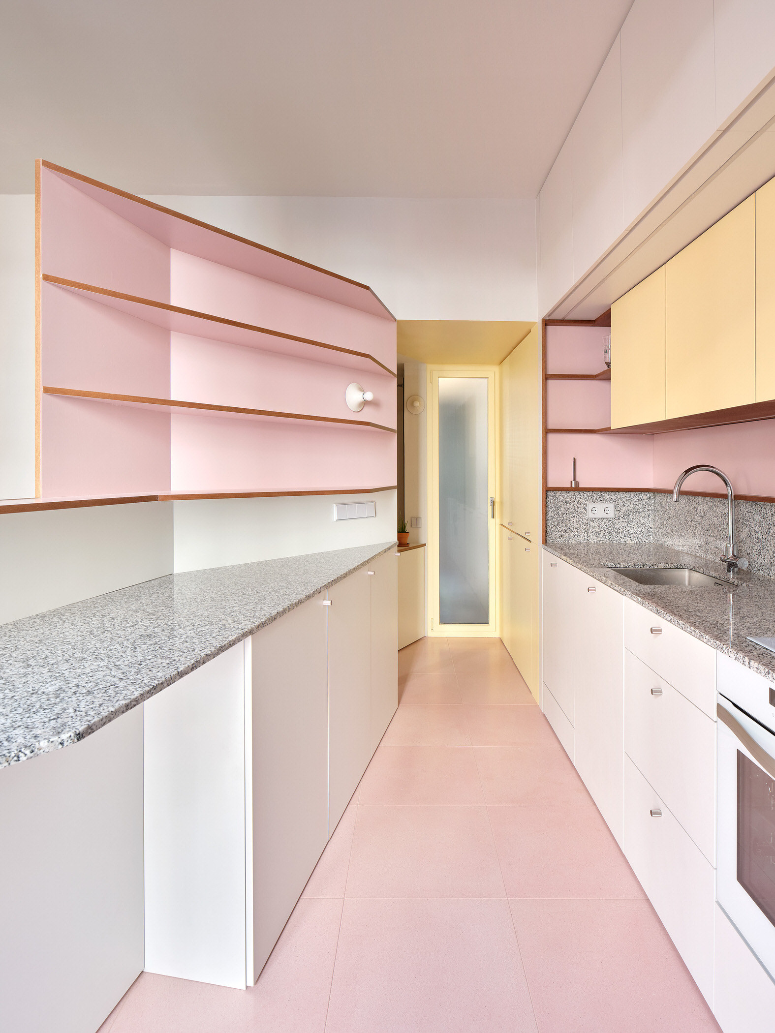
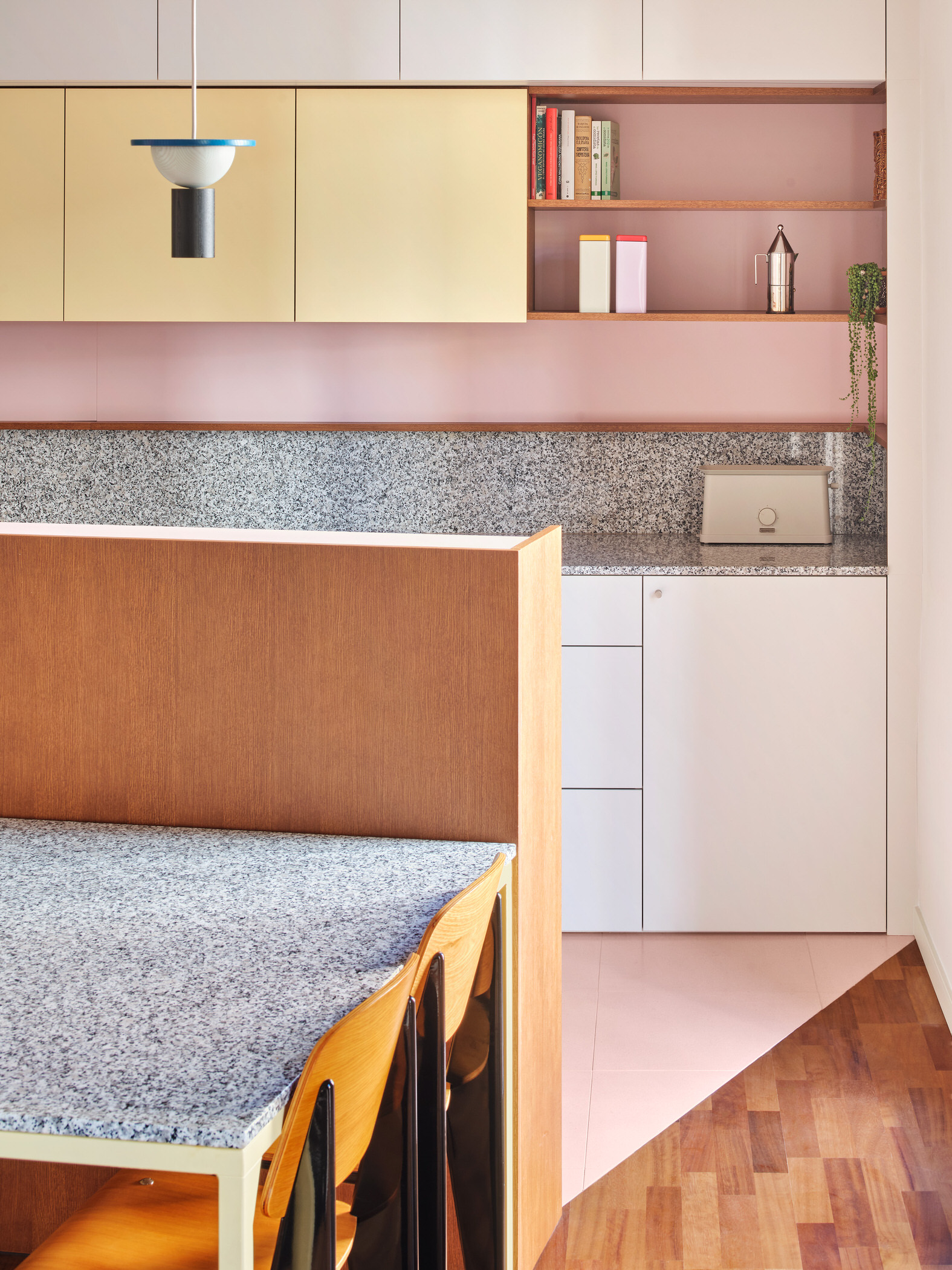
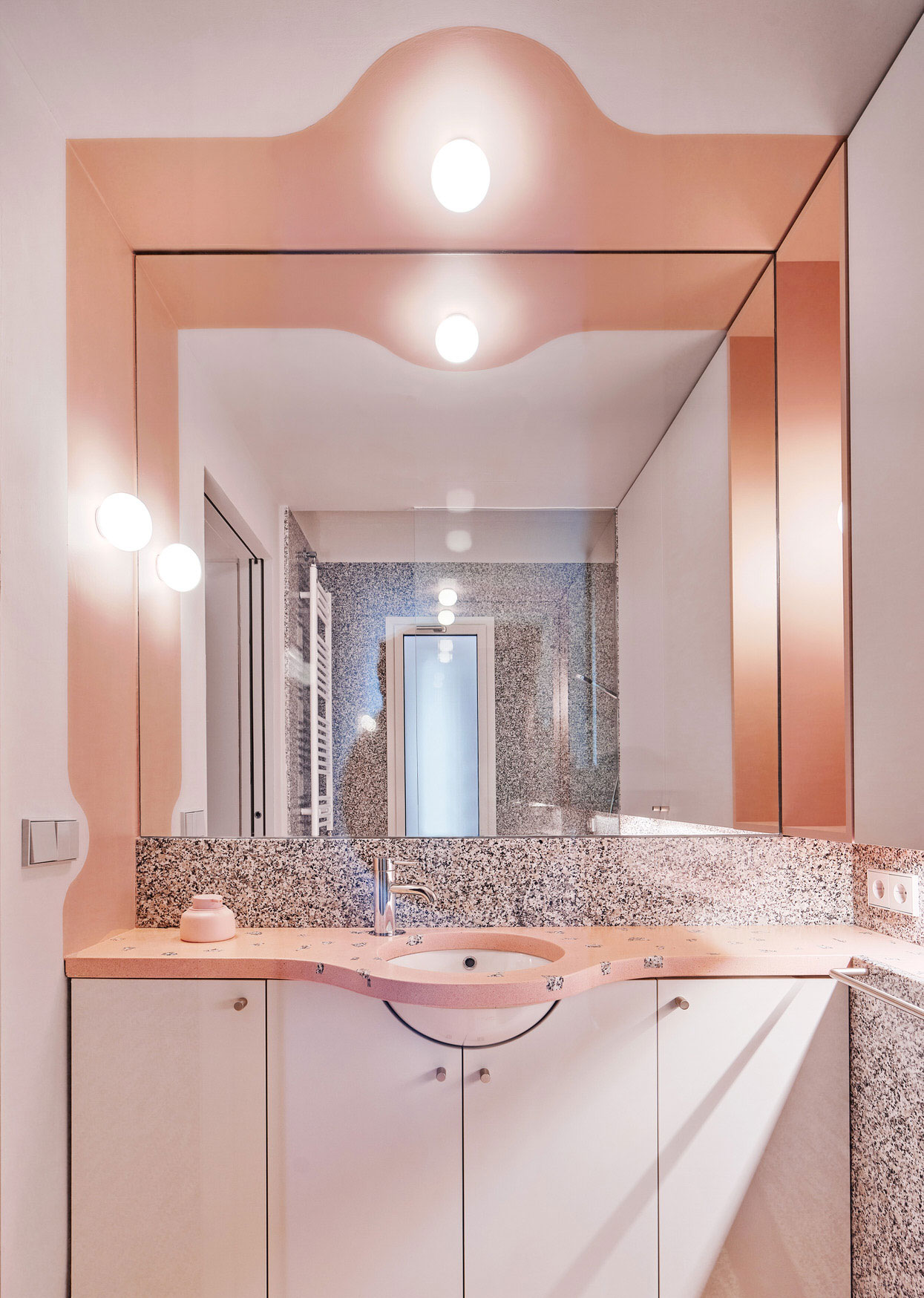
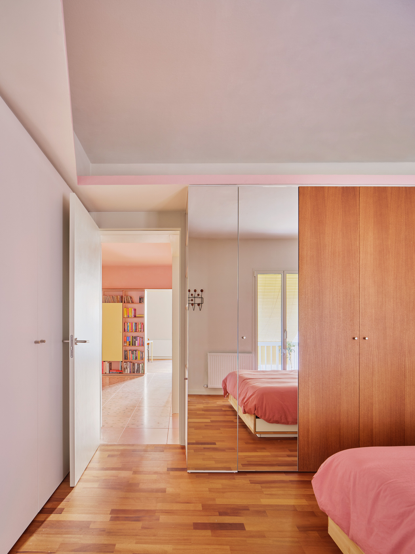
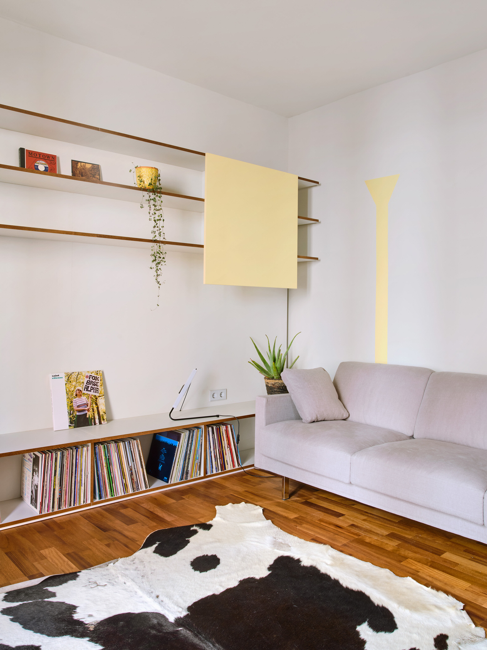
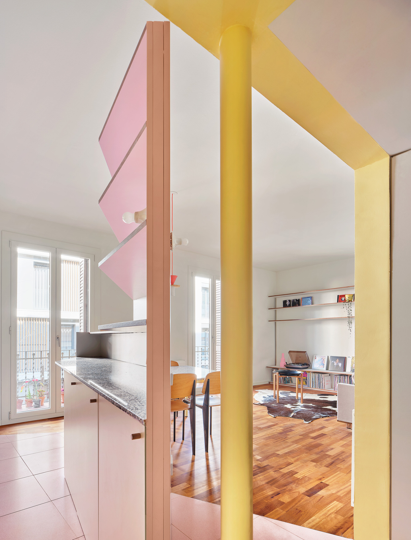
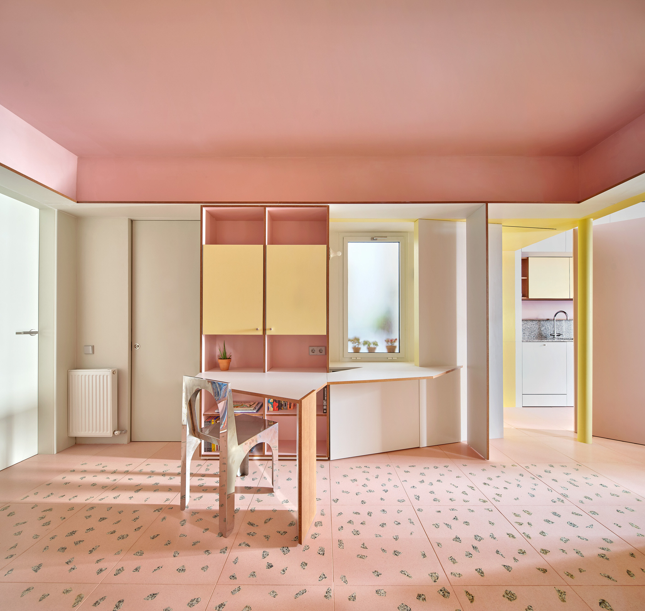
If you cut up a Battenberg cake and then arranged the slices in the shape of a house, you’d get something very similar to the insides of Barcelona-based design studio AMOO’s latest apartment project. Characterised by strawberry pink and lemon yellow squares and rectangles, the home is situated on the second floor of a small residential building in Barcelona’s Guinardó neighbourhood. It features two façades—one looking out to the street and the other to an inner patio—and envelops an interior courtyard that welcomes light to the deepest corners.
Back when principals Aureli Mora and Omar Ornaque stepped in for the overhaul, the apartment was hardly fit for modern consumption. “The original structure was very rational. It had three large rooms, each excessively compartmentalised with a distribution that did not respond to the needs of the family,” says Aureli. For him and Omar, the solution lay in figuring out something that did.
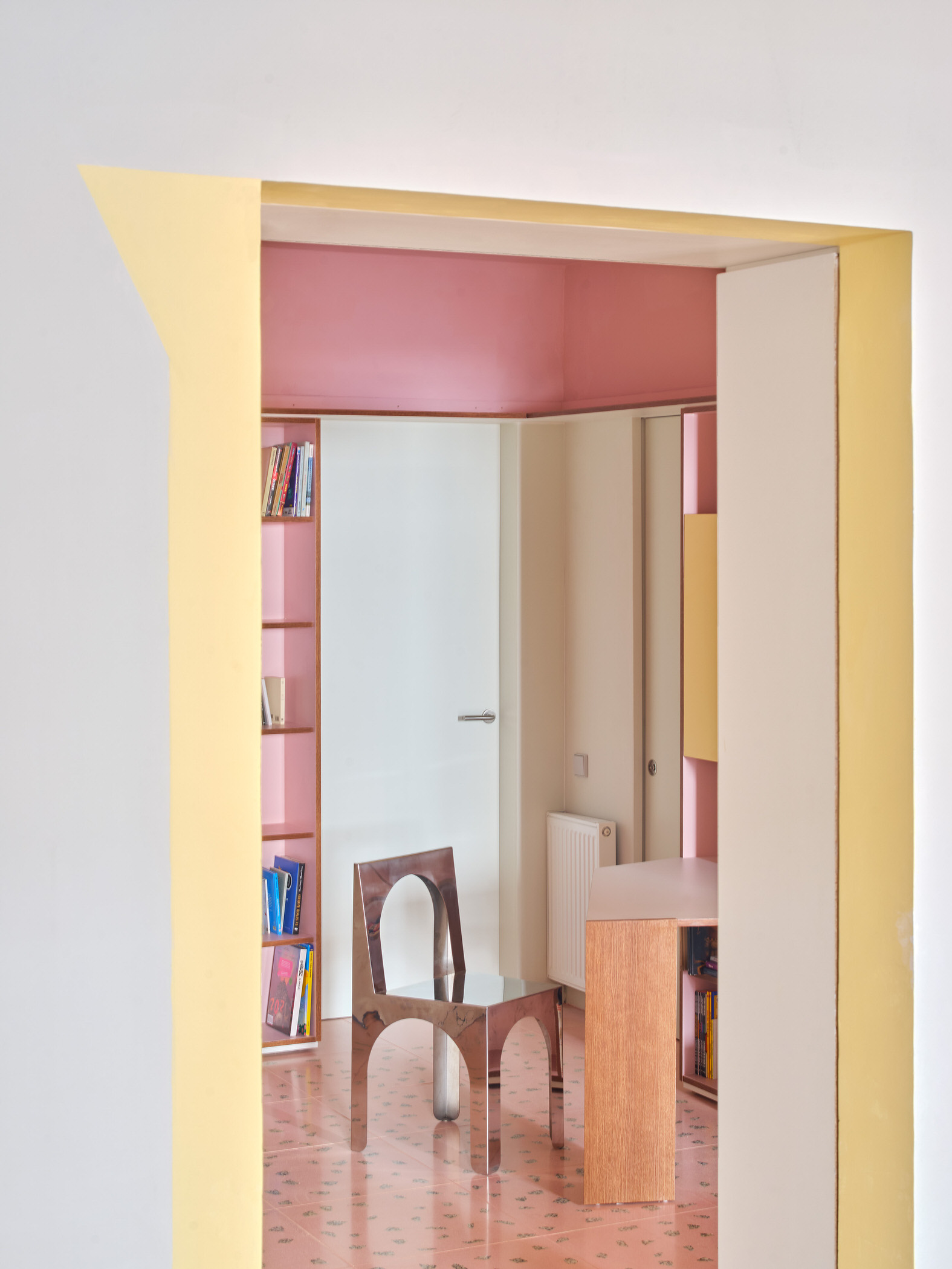
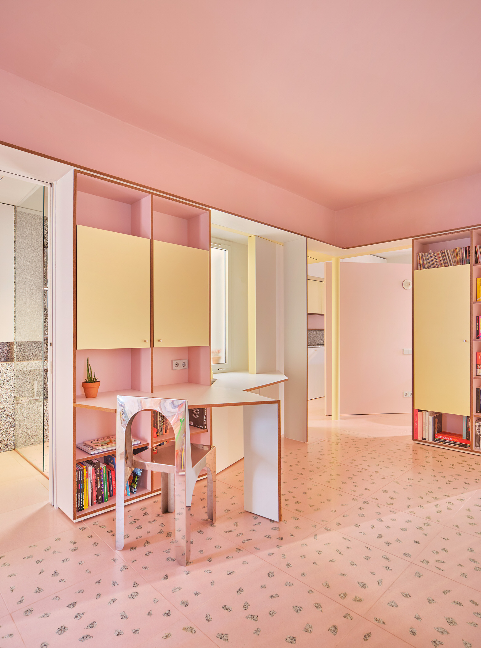
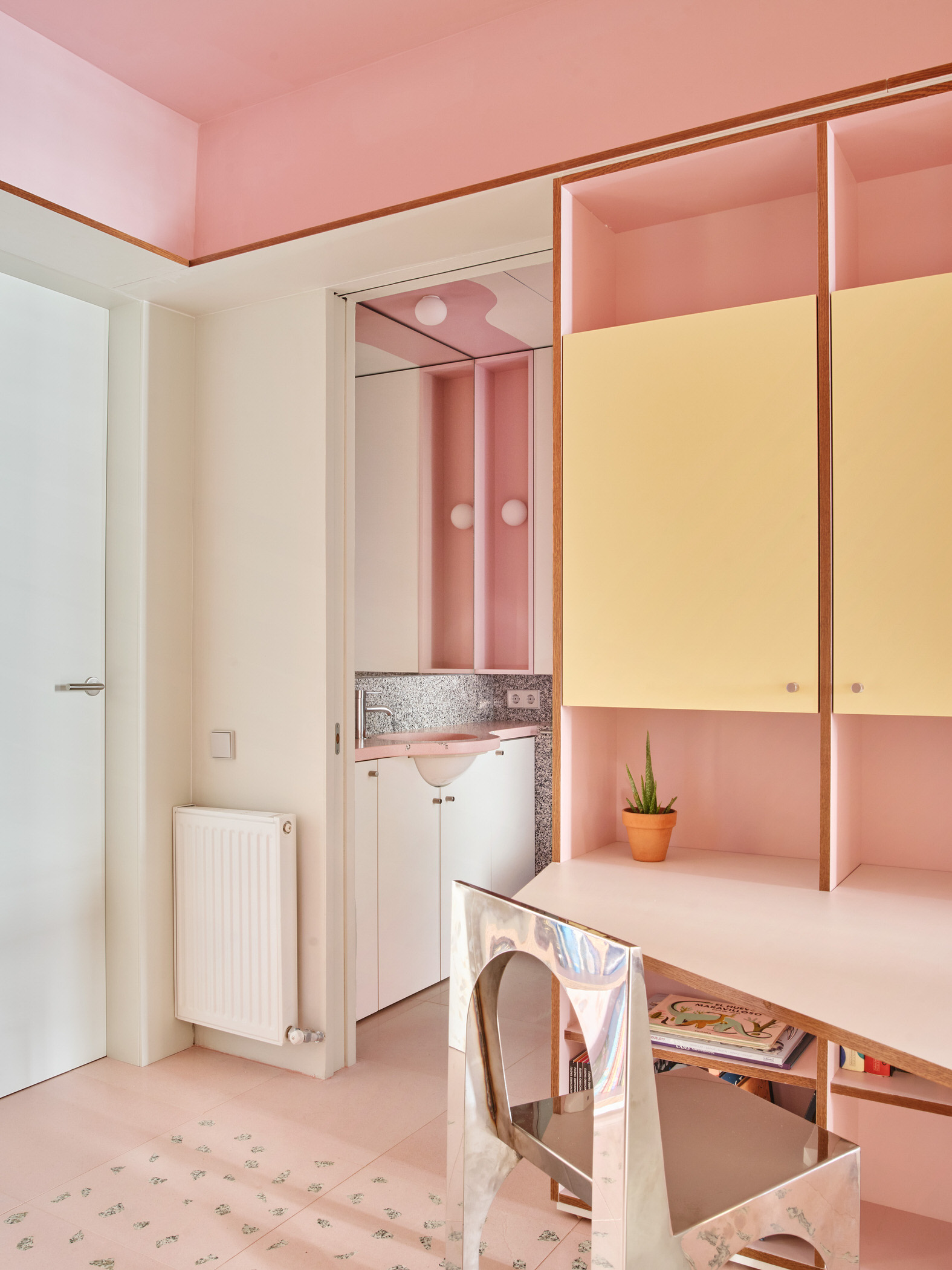
The architects set about following a three-pronged approach. First, they divided the home into three realms based on the corridors that separated them: that meant they had one space overlooking the street, a central heart, and another space towards the inner courtyard.
Then, they turned the central space into a multifunctional realm—a hall, gathering place, storage zone and study, all rolled into one. As for the other two spaces, the one overlooking the street was outfitted with a kitchen, living and dining areas, while the other, towards the inner courtyard, was magicked into a pair of bedrooms. The rationality of the demarcation is cured by the graphic pops and icing-like flourishes that play out like a pop collage—a reflection, the architects note, of the owners’ fun personality and lifestyle.
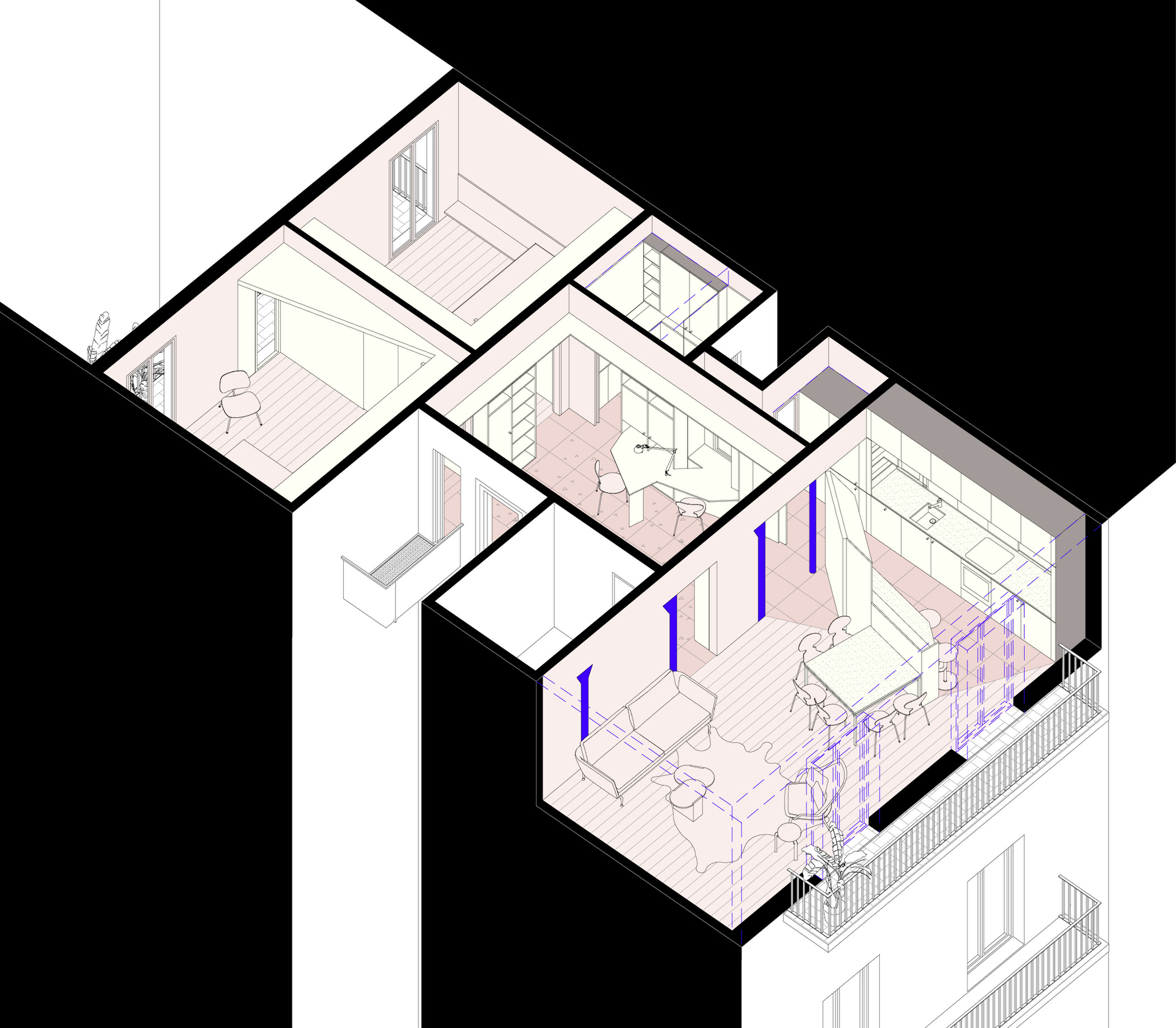 Axonometric of the multifunctional layout designed by AMOO.
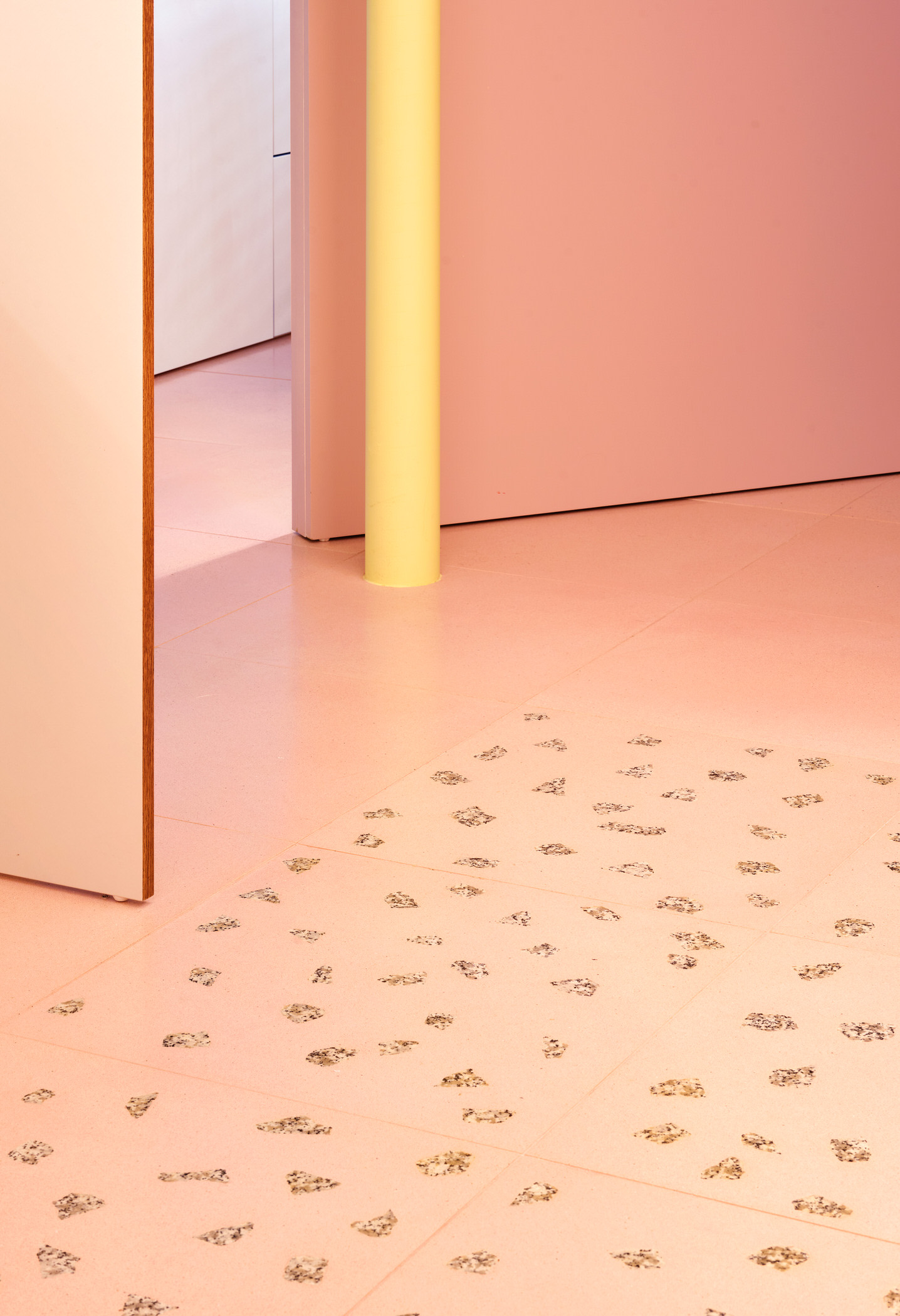
As far as materials go, Aureli and Omar opted for a smorgasbord of playful choices, including granite, terrazzo, iroko wood parquet, melamine, mirror, wood veneer and paint, often used together, as in the case of the stone ‘carpet’ of the central space, made with pieces of pink terrazzo and large chips of granite.
Today, the apartment is a far cry from its original version. With tailor-made spaces and a fantasia of icing tones, these owners can delight in having their cake and eating it too.

| The article Good Enough to Eat: A Cake-Inspired Barcelona Apartment by AMOO. appeared first on Yellowtrace. |

