A Sunny, Nostalgic Extension For A California Bungalow
Architecture

CosyCo Coburg is a renovated home by Drawing Room Architecture with interiors by Brave New Eco. Photo – Marnie Hawson. Editorial styling – Belle Bright Project

The rear extension has turned the Victorian-era bungalow from a 142 square metre home into a 215 square metre home! Photo – Marnie Hawson. Editorial styling – Belle Bright Project

Connecting the home to the outdoors was a key focus of the renovation. Photo – Marnie Hawson. Editorial styling – Belle Bright Project

Inside the retro-inspired kitchen, which blends function and form. Photo – Marnie Hawson. Editorial styling – Belle Bright Project

‘We set up a type of landing deck directly outside the kitchen and dining doors so the clients could grab herbs from the garden and easily kick off their boots or set up the high chair on this deck, half-inside half-outside for easy grabbing of utensils and snacks. Photo – Marnie Hawson. Editorial styling – Belle Bright Project

Photo – Marnie Hawson. Editorial styling – Belle Bright Project

The unifying colours of the beautiful plaid-upholstered bench seat echo the cinnamon tones of the floor, and organic mid-century tones in the kitchen. Photo – Marnie Hawson. Editorial styling – Belle Bright Project

Built-in shelves and nooks help showcases the family’s sentimental objects. Photo – Marnie Hawson. Editorial styling – Belle Bright Project

The new living area needed an existing window cut into a larger opening of french-style doors so the morning and lunchtime sun could pour in, allowing the family to easily enjoy views of the garden. Photo – Marnie Hawson. Editorial styling – Belle Bright Project

An original fireplace was retained in the living room. Photo – Marnie Hawson. Editorial styling – Belle Bright Project

Yellow tiles are a playful addition to the bathroom! Photo – Marnie Hawson. Editorial styling – Belle Bright Project

The warmth from the timber clad walls is enhanced by a long blade skylight that bridges across the bathroom. Photo – Marnie Hawson. Editorial styling – Belle Bright Project

A door closes the wet area from the vanity, allowing multiple people to use the bathroom at once. Photo – Marnie Hawson. Editorial styling – Belle Bright Project

The two-floor extension accounted for an extra bathroom, a work nook to support WFH and places to connect, cook, rest and play. Photo – Marnie Hawson. Editorial styling – Belle Bright Project

Inside of the additional living areas. Photo – Marnie Hawson. Editorial styling – Belle Bright Project

The second level houses the parents’ bedroom, connected to a set up a small sunny balcony. Photo – Marnie Hawson. Editorial styling – Belle Bright Project

Photo – Marnie Hawson. Editorial styling – Belle Bright Project
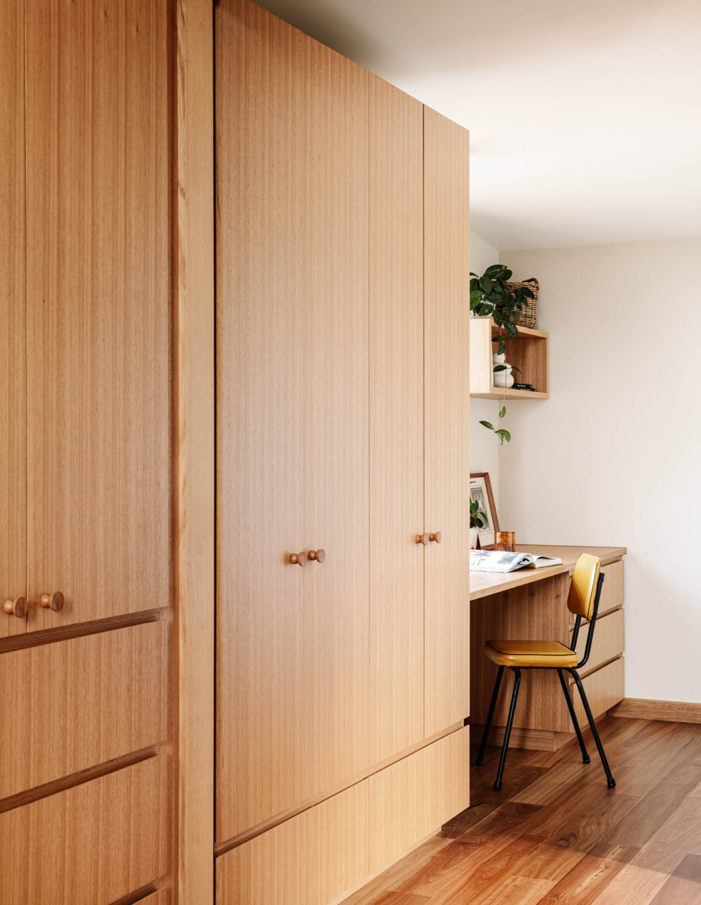
The home features maximum storage that can be easily closed off, or open for display. Photo – Marnie Hawson. Editorial styling – Belle Bright Project

Another cosy corner to enjoy some peace and quiet. Photo – Marnie Hawson. Editorial styling – Belle Bright Project
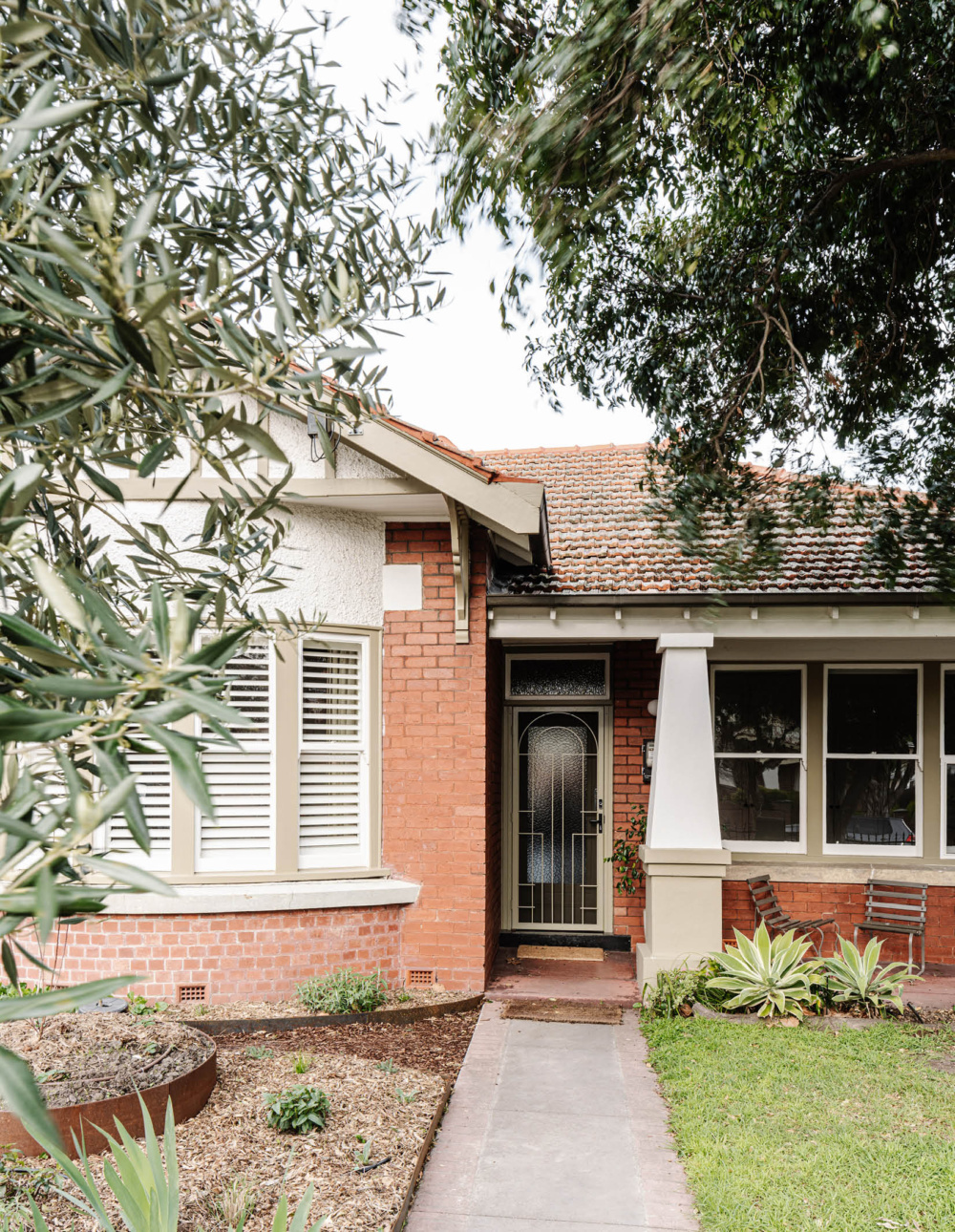
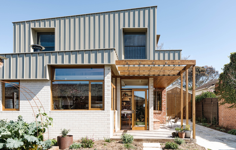
The exterior is filled with familiar and nostalgic charm. Photo – Marnie Hawson. Editorial styling – Belle Bright Project

Where the old and new parts of the home meet. Photo – Marnie Hawson. Editorial styling – Belle Bright Project
Before its renovation, this solid-red brick bungalow in Coburg harboured a shabby, asbestos-clad lean-to extension, closed off from the garden.
This was less than ideal for owners Sarah and Ben, who approached Drawing Room Architecture and Brave New Eco with hopes of creating an adaptable home that could serve their young family now, and into the future. But rather than focusing on strictly open-plan areas, the brief asked for spaces that allow for unity and separation – allowing the family to be together, even if they were doing different activities.
‘[Sarah and Ben] wanted someone to be in the kitchen area listening to music, while another person reads or watches the footy in the living area,’ Drawing Room Architecture’s Nicola Dovey says.
They imagined a kitchen that could ‘work hard’, able to look just as good when in chaos or clean and tidy. An extension carved out space for this newfound heart of the home, connecting the old to the new with steps, as other rooms were reconfigured completely.
‘We wanted all main living areas to have northern sun and easy access to the garden, so they were moved in the new extension footprint, [replacing] the demolished lean-to. The sunny sitting room was the existing dining room, with a new large opening carved into the northern wall to bring in warmth and light,’ Nicola says.
The additional challenge was bringing the old home up to speed on today’s sustainability requirements. Retrofitting insulation to the existing rooms and new heavy drapes ensured the old parts of the house could feel warm and cosy, while passive solar design elements like large, glazed doors and windows helped create the low-energy extension.
‘The unique aspect of this renovated Victorian-era home is that it continues to carry its unique heritage character yet works wholly in all the ways Victorian era houses fail,’ Nicola adds.
Brave New Eco’s layered interiors also enhance the refreshed, sun-drenched house. A beautiful stone benchtop is combined with a gunmetal sink and garden views in the kitchen, where earthy colours and subtle textures effortlessly hide daily fingerprints and smudges. A blend of timber and wood-grained laminate bring in additional warmth (as do the golden-yellow tiles in the bathrooms!) and the cinnamon tile floor was a practical and scuff-proof surface for kids.
‘I love the tones and textures, they are very nostalgic, and are evocative of an earthy childhood home with a kind of warm sepia tone of sunlight streaming through,’ Brave New Eco founding director and principal designer Megan Norgate says. ‘Sarah and Ben’s house existing home was joyously curated with a mishmash of old and handmade, each item much loved and with a story attached and we wove this idea into the new spaces.’
One of the standout features – the open-shelving that links the living and the kitchen – even evolved out of a suggestion from the owners. It’s just one example of how the design blends function and form, creating a home for their beautiful objects and beloved records, while also meeting their original brief for a family home that embraces connection.
