

Five years later and with four growing children nearing their adolescence, a family of six decided to give their three-storey lone-standing brick residence in Melbourne a facelift that would allow for the growing elbow room. Commissioning local architects Kennedy Nolan, the team provided a refreshed presence on the street front, and an interior that’s undergone a Cinderella transformation to suit the occupants’ lifestyle.
Matthews House was originally designed by late Melbourne modernist architect, Theodore Berman, who was known for his ‘catalogue of era-defining bowling alleys’ and eventual lavish houses that one may attribute to a mansion. The original footprint of the family residence very much reflected on the mid-century occupancy of the servants and the owners. This provided an interesting challenge for Kennedy Nolan to work with, as well as an opportunity to reshape the spaces to offer modern and timeless functionality.
“Conceptually, our aspiration for this project was grounded in the elevation of an eroded and imperfect twentieth century aesthetic with a strengthening, and in some cases correction, of an established planning principle,” says practice co-principal Patrick Kennedy. “We find it useful to look at projects like these as a series of problems to be solved, or a suite of optimisations to be achieved.”


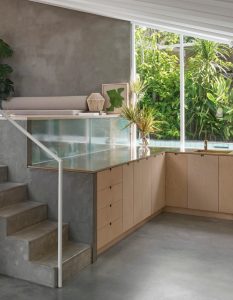
The majority of floor plan editing involved the ground floor and private areas on the levels above. The kitchen area in particular, rather dated in the current times and functionally cramped, is expanded, amalgamating with the former maid’s quarters to allow a better connection between internal and external garden space.
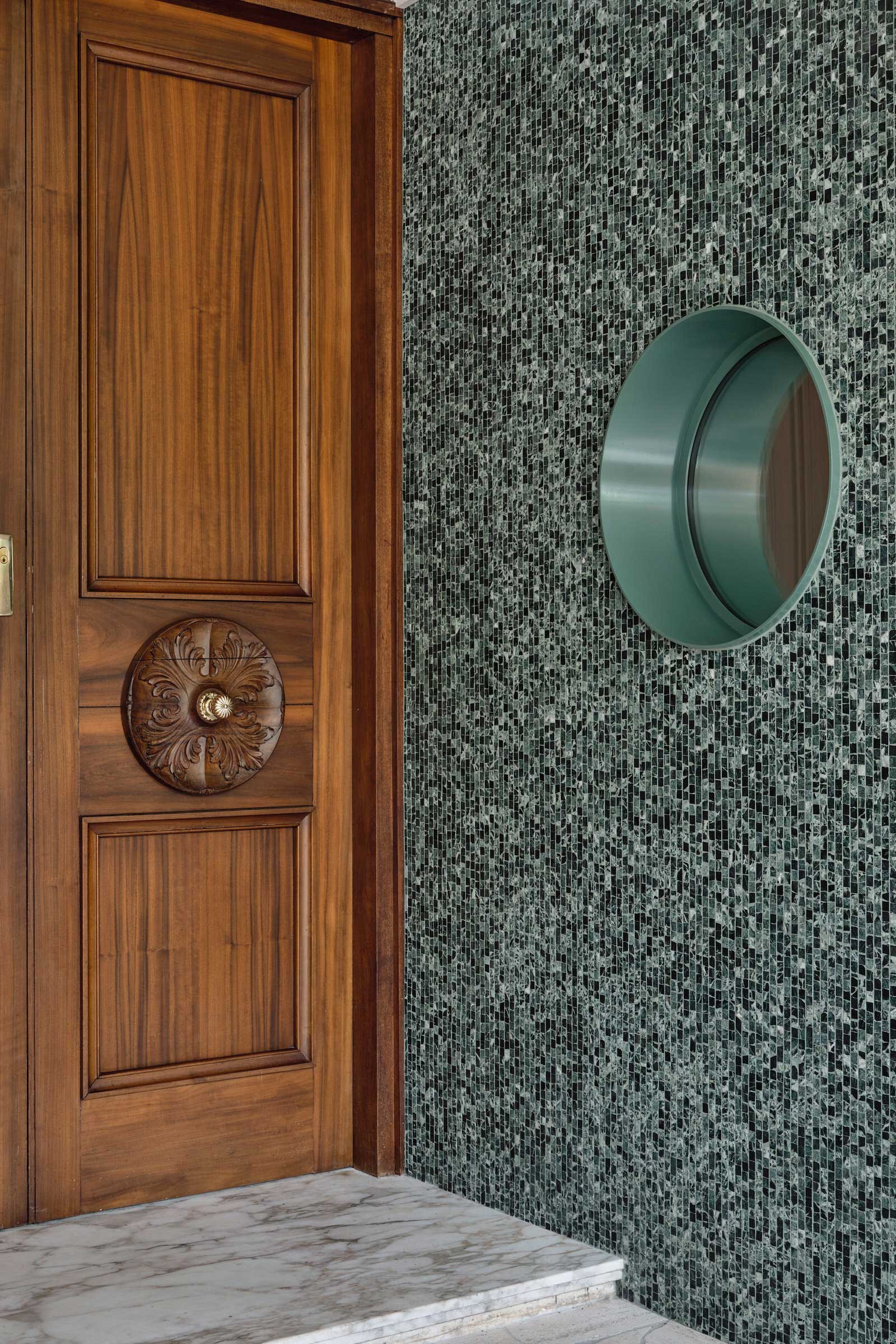
Arresting Verde Alpi Green marble tiles are spilled from the statement wall to the kitchen counter to the island bench, contrasted by provincial white cabinetry and raw Classico Travertine flooring. Against the impressively tiled wall is a circular porthole that was once a large opening into the exterior which has been reduced—a classic Kennedy Nolan motif often found in their residential projects.
“Materials were chosen to honour the modernist heritage but also for longevity and robustness—a combination of Classico raw travertine with the intensely deep tones of Verde Alpi applied in varying scales to heighten the overall textural experience and create a visual hierarchy,” explains project architect Adriana Hanna. “We used a range of slabs, large format tiles, Palladio [stone], crazy paving and mosaics.”


While the aesthetic was inspired by Mies’s iconic Barcelona Pavilion, it was integral the introduction of new materials was intentional and would integrate well with existing ones such as the classical timber clad joinery, thresholds, and of course, the classical marble flooring. Continuation of the emerald marble is found in the powder room, paired tastefully with walnut timber panels and gold tapware and existing flooring. The walnut that was heavily paired with salt-lake pink stone on the upper levels was also modified, with the pink now replaced as soft highlights that grace the textiles used in bedroom cabinets and staircase carpets, bathroom counter cabinets otherwise speckled in the marble of the main bathroom. To push the language further, micro-circular white tiles are lined in the main bathroom—a similar treatment that resonates with the mosaic-like green tile found on the other side of the porthole surface.
A robust face-lift to a beloved home, Matthews House is a thoughtful tribute to the mid-century modern era that now many would flock to. After all, it’s not about giving the house a completely new identity, but carrying its history with pride and providing space to further the well-established narrative.


