Emotional design is all around us. You engage with emotional design every day without realizing it because when emotional design is done well, it’s invisible.
Invisible design? We know, it sounds counterintuitive. But trust us on this—the most successful designs are successful because they tap into your emotional subconscious. They make you feel good, even when you can’t quite put your finger on why they make you feel good.
In fact, you might not even consciously realize that these products and their designs are making you feel good…but you continually go back for more because every time you engage with them, it’s a positive experience.
Emotional design is one of the most powerful tools in a brand’s toolkit. If you aren’t appealing to users’ emotions, you’re not appealing to users. It really is that simple—and that complex. Keep this in mind as you develop your engaging, successful brand and its signature design assets.
Defining emotional design
—
Emotional design isn’t a specific style like Memphis Design or Brutalism. Rather, it’s a concept: the concept that design can and should make viewers feel specific emotions. That’s why two designs can have a wildly different look and feel and still both be considered examples of emotional design.

Emotional design is any design that intentionally evokes an emotional response in its viewer. It doesn’t tell the viewer how to feel, it creates feelings in the viewer through deliberate design choices.
Think about the online job application portals so many companies use. If you’re like most people who’ve had to deal with them before, you’re probably feeling stressed and frustrated just thinking about them. With big blocks of text, their autofill features that maybe, sometimes, sort of work, the redundant information they ask for, and the way some end on an ambiguous note, it’s no wonder you find yourself asking, “did my application go through?”
Now imagine an online job application that’s not cluttered. One where there’s a progress bar that shows how close you are to the end with every field you enter information into. One that doesn’t only make it abundantly clear when you’re done, but tells you exactly what to expect next, be it an email within the next month or a phone call within 14 days, etc.
That sounds a lot less stressful, right? Our imagined job application is one that incorporates emotional design to make applying for a job a painless, responsive process.
Don Norman’s three levels of design
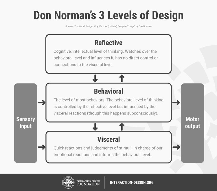
Donald Norman, director of The Design Lab at University of California, San Diego, and author of multiple books on design, including “The Design of Everyday Things”, has done extensive research on the concept of emotional design. Through his research, Norman identified the three types of cognitive responses users have to products’ designs:
Visceral:
A user’s immediate, automatic response to a design.
Behavioral:
A user’s subconscious evaluation of a design’s capacity to help them achieve their goals.
Reflective:
A user’s conscious judgment of a design’s usefulness and value.
Emotional design is nothing new. When the first ATM appeared on the scene, it satisfied users’ emotional need for instant gratification. Drive-throughs satisfy something similar—the desire to not step out of one’s car, even when going inside a fast food restaurant or a bank would be faster than going through the drive-through.
Emotional design aims to create positive associations
Emotional design drives you to take specific actions and make specific associations. Designers employ a few strategies to do this, like color psychology and gamification.
The goal is to create a positive association with the product. That could be by evoking a positive emotion, like joy or power, or it could be by first evoking a negative emotion, like fear or disgust, then promising that the product will alleviate that emotion.
Going back to our example job application portal, an ad for this software might show job applicants getting frustrated and clicking out of it, leaving their applications unfinished.
To the employer who’s shopping for a valuable application program, this hits on the fear that great candidates might not bother applying if the process is drawn-out and frustrating. So to relieve that fear, they buy the streamlined, responsive program designed to make the process more enjoyable for applicants.
See how emotional design is used at different points in this journey?
First, the employer saw the emotional design used in ads for the software and opted to buy it. Then, job applicants had an easy time with the software, which created a positive association with the employer in their minds.
This meant more applicants, applicants who already have a positive view of the company, applying for jobs—and for the SAAS company that built the software, positive reviews and referrals from the employer who bought it.
How can I “do” emotional design?
—
The path to your target consumers’ wallets goes through their heart and their brain. To use emotional design effectively, keep Norman’s three levels of design in mind as you craft your brand identity. Your designs should evoke an immediate emotional reaction from the user, but also communicate that it’s going to benefit them. That way, when their brain catches up to their heart and has to determine whether your product is actually valuable, it won’t have any room to doubt the heart’s assessment.
Six steps to emotional design
When you’re creating emotional designs, keep these six key points in mind:
1. Understand your users’ base desires
When a person sees an ad for an investment platform, they might consciously think “I’d like to start investing.” But that thought has deep roots that are far more basic than wanting to download an investing app.
We all want security, and money buys security. So for an ad for an investment app to be effective, it needs to tap into that emotional need for security and stability.
When you’re designing marketing materials and other brand assets, think about what you’re really offering. A restaurant isn’t just offering a unique menu in a cool venue; it’s offering sustenance.
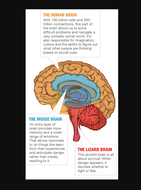
To understand our base desires better, read up on the concept of the reptile brain. This concept posits that at our brains’ cores, we still retain the more primal brain structure our evolutionary ancestors had. This basic brain, one that can still be found in reptiles (hence the name), is responsible for functions related to self-preservation and survival.
A luxury car ad taps into the reptile brain’s desire for status within one’s social group. A website for a home security system assures visitors that its products will keep them and their families safe.
No matter how many millennia go by and how far we evolve, we’ll always carry prehistoric, primal structures within our brains—structures that respond to emotional design.
2. Create a character and engage as this character
This doesn’t necessarily mean you need a mascot, but that interacting with your brand should feel like interacting with a person, not a faceless corporation. By engaging as a character, you’re giving your audience somebody to care about—and somebody who they feel cares about them.
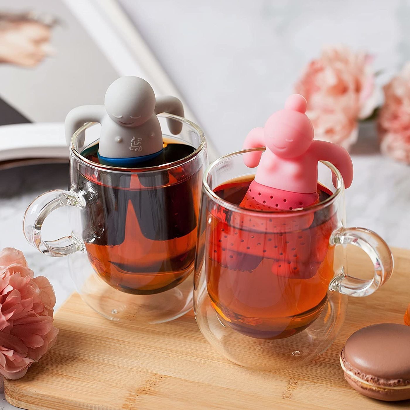
Engaging as a character means staying in character through every touch point with the customer. That means writing your website, email, ad and any other copy in a voice that “sounds” like this character. Is your brand youthful and playful? Then your copy should employ fun, engaging, optimistic words and phrases.
3. Make users feel a sense of ownership
People feel attached to the things they feel they own a small part of. Find ways to make your audience feel like they’re part of the team when they interact with your brand. A few ways you can do this include:
- Giving them a unique demonym that designates them as part of an “in crowd.” This might mean starting off every email with something like “hey fashion insiders,” or creating a rewards program with a name like “coffee connoisseurs only”.
- Offering highly responsive, branded customer service. Think about the difference between getting your computer repaired and bringing your Mac to the Genius Bar. The first is available to anybody. The second is reserved for members of the Apple community.
- Make it easy for your audience to identify with your brand. When people see themselves in a brand, they value it higher. Think about how car aficionados identify with the makes of their vehicles.
4. Tell stories
What does every good story do?
Stir up emotion in its readers. One way to build emotional design into your brand persona is to become an expert storyteller.

Airbnb is one brand that’s baked storytelling into everything they do. From their Belong Anywhere campaign that they used to raise more than $1 million for refugees to their collection of stories from the global Airbnb community, Airbnb capitalizes on one of the most valuable things they offer: unique experiences and the stories you’ll tell about them for the rest of your life.
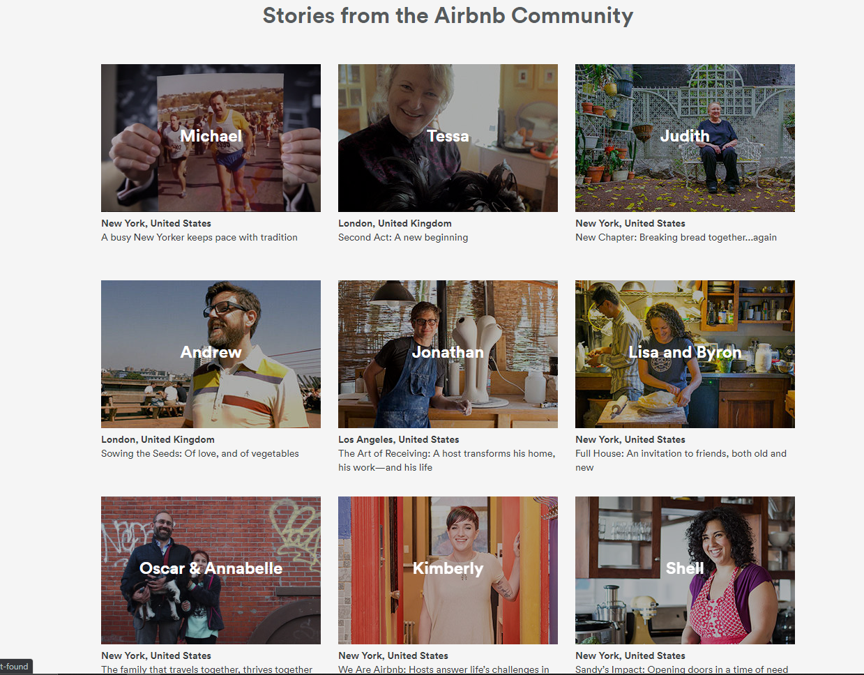
Airbnb uses storytelling by showcasing how these stories make community members feel: happy, warm and accomplished. They do this by using warm images that feature smiling people, many of whom are engaged in creative or meaningful activities. Alongside these images, Airbnb uses their minimalist branding aesthetic to keep the page consistent with their other pages and remind readers who’s responsible for these smiles: them.
You can use storytelling the same way Airbnb does. What does your brand provide, and how do you provide it? Tell your company’s backstory through emotionally engaging design, which might be a thoughtful Our Mission page or a design that highlights testimonials where previous clients share their personal experiences with your brand. These kinds of designs shape how your audience perceives your brand as a character and enable them to feel like they’re part of the story by engaging with your brand.
Stories don’t have to be told as linear sequences, either. Think about poetry, abstract illustration and even one-panel cartoons. The most effective way to tell your story might be a set of visual bullet points, like in this infographic by ca.creative:
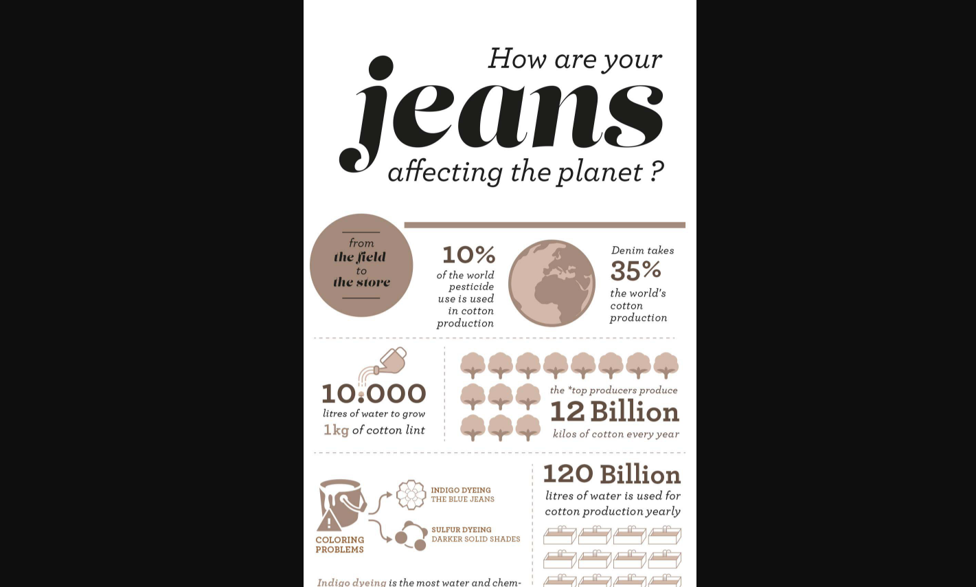
While this infographic doesn’t tell its story as a traditional narrative or center a brand as the story’s hero, it packs an emotional punch by sharing facts, some of which can be uncomfortable for the reader, as a set of details that give the reader a fleshed-out look at the current state of the denim industry and consumers’ jeans-related habits.
This story is more of a journalistic piece than a biography, but it achieves its goal of provoking an emotional response in the reader all the same. An infographic like this can be a very compelling story for a thrift store or denim recycler to post on their social media pages.
Think of storytelling as sharing narratives that stir up emotion and drive action. Whether you go with a traditional tale with characters and conflict or more of a journalistic approach is up to you.
5. Little details matter
You’ve seen a million 404 error pages before. We all have. Most of them are forgettable…but not all of them. Brands that go the extra mile to create an immersive experience for their users pay attention to details like error messages, packaging colors and material choices, user feedback animations and other seemingly small things that are easy to overlook, but aren’t overlooked when they aren’t generic.
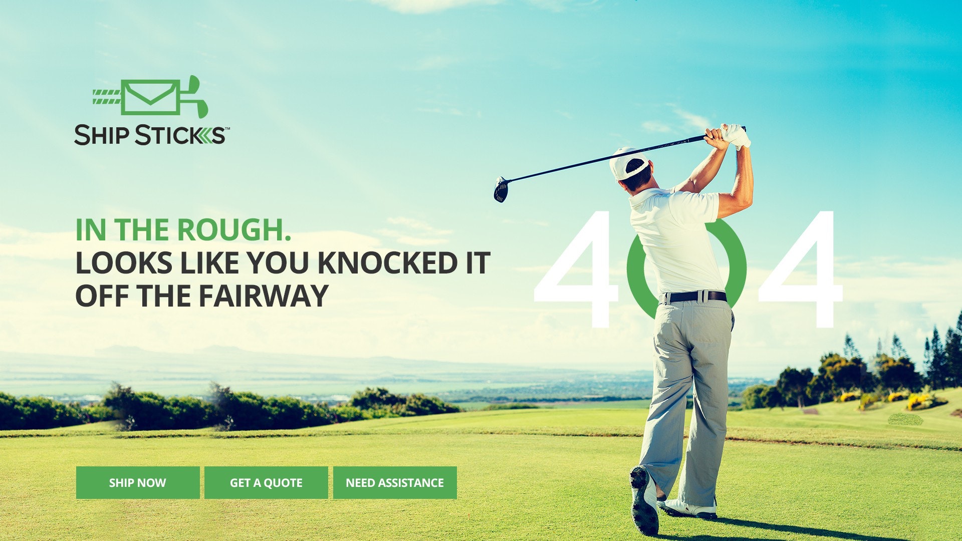

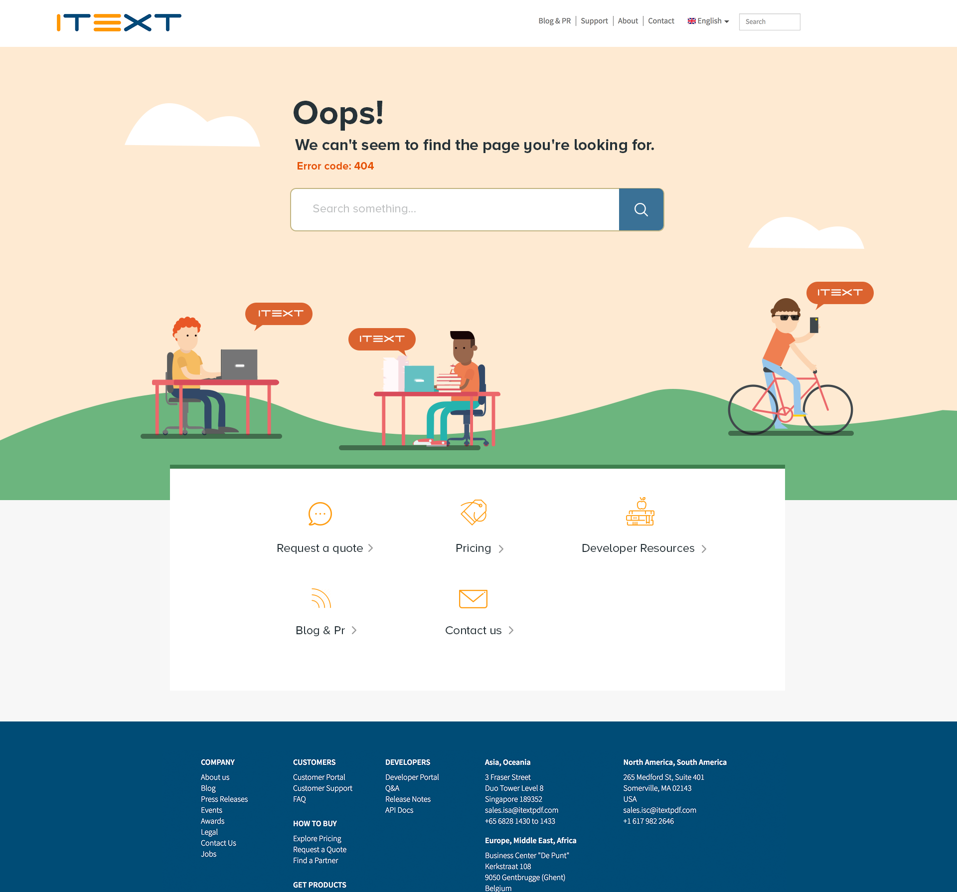
You can find little details in just about every kind of design. Check out how these designers worked them into products and product packaging:
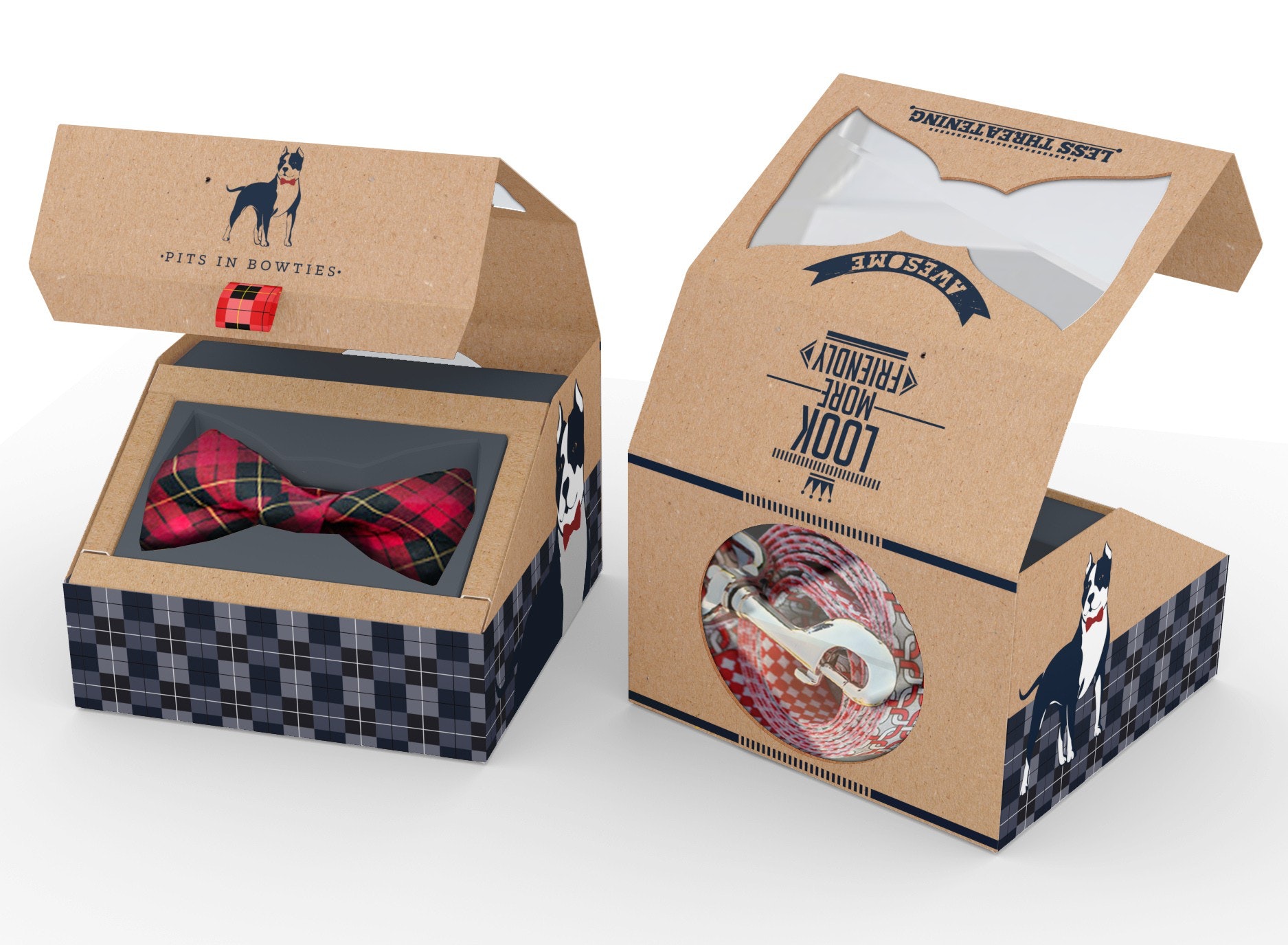
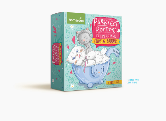
If you’re an ecommerce company, a cute animated kitten that follows the user’s mouse around the screen as they add items to their cart can elicit the “awww” factor. Then, when their package arrives, a thank-you note signed with an inky paw print can be the perfect extra detail that makes them smile and creates a positive memory with your brand. Think about ways you can incorporate these little details into your design to create positive memories and connect with your audience on an emotional level.
6. Give users little bonuses
Similar to the point above, give users little bonuses that reward them for interacting with your brand. You can lean into the building ownership aspect by giving customers points they can redeem for exclusive merchandise at a later date or make them feel like you care about them personally by adding small treats to their orders, like stickers or candy.
Just remember that although your bonuses should be on-brand, they shouldn’t just be vehicles for your logo. Stickers are fun, but throw in stickers that aren’t simply your logo.
For a cyberpunk fashion brand, this might mean a handful of shiny laptop stickers. For a pet brand, it might mean a sheet of little paw print stickers or a resizable pet food scoop so your buyers’ pets’ meals are always portioned perfectly.
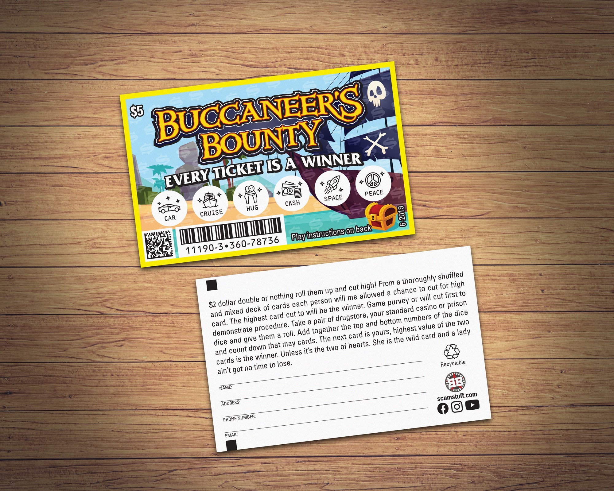
This strategy can also go a long way in humanizing your brand because you can use it to create an insider language with your audience through memes and inside jokes. Maybe you’re an offbeat winery who refers to their drinkers as “grapeheads.” A fun bonus for frequent buyers might be a purple beanie or a bottle stopper topped with a smiling grape ornament.
Emotional design in action
Take a look at these examples of emotional design in action:

In this book cover design by Boja, they promise the viewer that yes, you can start over again and pivot to a new career. Student debt is a highly emotional topic that’s on millions of minds, and it’s got people ranging from high schoolers to retirees anxious about how they’ll manage it and whether their education is really worth what it cost.
By tapping into those anxieties through visceral language (“dump your degree”) and a jarring image of diplomas in a trash can, then promising a solution with an action-oriented tagline and an optimistic bright yellow background, Boja hooks readers with this design.
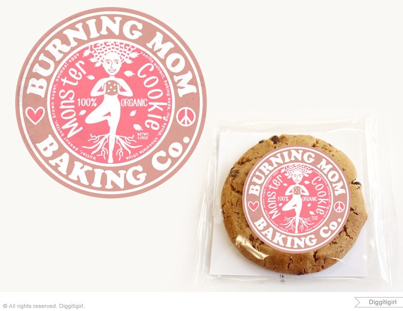
In Diggitigirl’s design for Burning Mom Baking Company, they create a sense of warmth and dependability, two things you might typically associate with a mother, through their choice of brown and pink as the color palette. The logo’s round shape adds to this sense of friendliness and approachability, two more traits often associated with mothers—and thanks to this design, associated with Burning Mom Baking Company’s tasty products.
This brand makes organic products, which Diggitigirl communicates by styling the woman in the logo image as a tree with roots that run deep into the soil. She’s a nurturer, a provider of healthy sustenance.
Another seemingly simple logo, this logo by minimalistic.a.t represents joy. Using just three colors, one font and a flat, geometric graphic, Typfred’s logo represents the freedom of riding a moped, wind rippling through your hair, and the cheeky carefree feeling that comes from moments like that. Its allure comes from the promise of simple, open-ended fun.
Make an impact with powerful emotional design
—
If you want your design to successfully connect with users, it needs to connect with them emotionally. A skilled designer knows how to tap into users’ hearts as well as their minds by demonstrating exactly why your product is the perfect choice for them. There are lots of ways to do this, like through thoughtfully chosen color palettes, compelling copy, small details and uniquely user-friendly shapes and styles, and even the way information is presented.
Think about how designs like Boja’s book cover with college degrees in a trash can and Luz Viera’s packaging for the kitty cups make you feel. Empowered? Reactive? In awwww?
Good. If a design speaks to your heart first and your head second, it’s doing exactly what it was meant to do.
