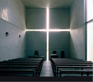
Welcome to our new blog series ‘Victor’s Design Insight’. Within these articles, I explore the influence behind landscape design and where I take my inspiration. In this introductory post, I am starting from the very beginning and exploring the root of my passion for spatial design, and the power of simplicity within Landscape Architecture.
The influence behind my Garden Designs
Unity, rhythm and repetition, simplicity, scale and balance, hide and reveal, borrowed views, framing views, patterns, textural contrast, balance and form, harmony, genius loci, impact, focal points. These are all wonderful words and phrases we associate with garden design and architecture. Spatial designers all over the world use these words in abundance, and to some of us it may sound like a load of nonsense and nothing but ‘flowery language’. If we take the time to look and truly listen to the meaning of some of these words and phrases, a whole new world really opens up to us and presents true beauty in places and things you never thought possible. Yes, even concrete can be beautiful.
When I was a student doing my degree in production design it was required of us to do a written thesis on any subject you like. I quickly asked my wife (girlfriend at the time) in a panic to find an Architect on the internet (it was the nineties and I had no access to the internet and to be honest, I didn’t know how to use it) and print out some information so I had something to bring to class on Monday. The random architect she picked was Japanese architect Tadao Ando. From this moment on my life changed and I fell head over heels in love with the simplicity and power of his work. The thesis I wrote was tilted ‘Japanese Architecture and its Relationship with Nature’. For my final year, my thesis was titled ‘Balance and Form in Architecture’. My senses were awakened and there was no going back.
I truly believe that it was an awakening into my soul and to this very day, it gives me great confidence, even when the chips are down, knowing that I have experienced an enlightenment that can never be taken away from me.
In this blog, I will be looking at some of these principles of design and drawing your attention to some amazing examples where this beauty takes place. I will be looking at Architects such as Tadao Ando, Peter Zumthorpe and Luis Barragan, along with other handpicked examples. I will relate their principles, which are easily visible in their work, and how they transcribe into the design of a garden. Without boring you with large passages of reading I will simply guide you through some great images over the next few blog posts, and allow the work talk for itself.
I hope these images and explanations may allow you into this world, even just for a moment, and help give you a better understanding of some of the very basic elements that make a garden and its design work, regardless of its style and taste, a wonderful place.
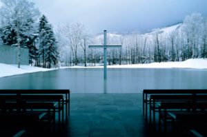
Tadao Andos ‘Church on the Water’ http://architectuul.com/architecture/church-on-the-water
This image, Tadao Andos ‘Church on the Water’, really opened my mind to the power of simplicity. Tadao simply frames the existing views through the use of straight lines and flat planes. He places one object, the cross, in the centre of the frame, creating a picture of absolute beauty. The contrast of line, flat planes, texture, the natural shape and forms of the landscape, the contrast of hard construction and soft planting is enough to capture our imaginations and entertain us. The repetitive seating kept extremely basic and stretched low to match the widescreen window frame, adds patterns and rhythm to the experience.

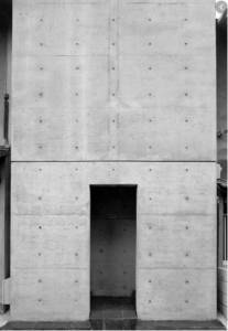
https://www.interactiongreen.com/tadao-ando-row-house-sumiyoshi/https://www.nytimes.com/2018/10/17/arts/tadao-ando-architect-france.html
Tadao Andos ‘Church of Light’ and entrance to Row House in Sumiyoshi. Concrete, looking elegant and beautiful.
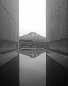 Shin Takamatsu https://www.pinterest.co.uk/pin/453878468685508887/
Admire the simple walls framing the natural landscape. The simplicity of this design makes the image and gives it such an impact. The natural framing that the hard structure creates reminds me of the comments by the Japanese author and novelist Junichiro Tanizak in his essay on Japanese aesthetics and enlightening the world on the beauty and importance of shadows. He explains in his essay ‘In Praise of Shadows’ that the Japanese house is a viewing platform of nature.
This simplicity, framing of views and beauty can be also seen in Peter Zumthorpe’s thermal baths.
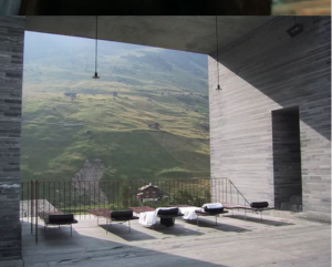
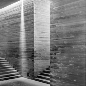 Peter Zumthorpe’s Thermal Baths
https://www.pinterest.co.uk/pin/268949408967498727/ http://www.interiordesign-addict.com/2017/09/interior-design-addict-via-promenadearchitecture-thermal-baths-vals-peter-zumthor-vals-switzerland-5/
Built using stone quarried from the surrounding landscape of the Swiss Mountains, Zumthorpe has demonstrated such beauty so simply. Simple lines, flat planes and repeating steps creating patterns.
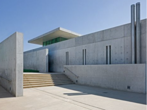 Tadao Ando Pullitzer Foundation for the Arts https://www.pinterest.co.uk/pin/147000375317837227/?nic_v2=1a79U9Xbc
Another demonstration of Tadao Ando’s work with more patterns, rhythm and repetition. Look how the steps create patterns and balance with the flat planes of concrete. The slender cut-outs on the walls perfectly spaced and repeated. Alcoves and gaps behind walls introduce shadows emphasising the solid forms.
How we applied the same thinking behind our Garden Designs
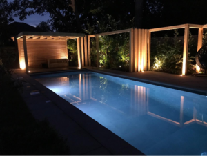
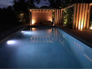
Oakleigh Manor Swimming Pool Design and Build in Surrey.
These images of a pool garden were designed with great emphasis placed upon pattern and repetition. The lines repeat through the use of Western Red Cedar timber uprights and introducing patterns. At night, because of the nicely placed lighting, the patterns are more pronounced and add to the drama and impact of the space. Peter Zumthorpe talks of atmosphere and moods set by a space and its design. He talks about its importance on how we feel. Seen in the images of this swimming pool design, all the calming patterns, added light praising the shadows and simple layouts create such a strong atmosphere and the space becomes entirely transformed.
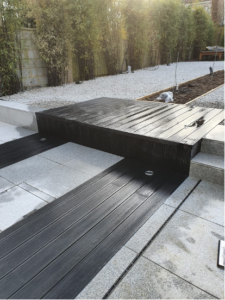


Garden Design & Build Project, Upminster alongside Tadao Ando’s ‘The Row House’
This project was close to completion in the image and was designed and built by our team at Oakleigh Manor. It shows through the layout and shapes created how the inspiration for simplicity and form can be taken from other disciplinaries such as Architecture and applied to the landscape and garden design. In this design, I took inspiration from Ando’s Row House entrance, as seen above
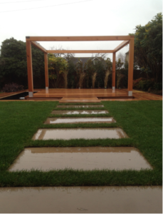

Garden Design & Build, Iwade Kent
Patterns in stepping stones and use of line and form.
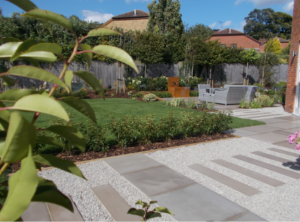
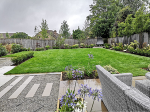
Garden Design & Build, Wrotham Kent
Using plank paving and 10mm Kentish Ragstone gravel to create patterns, rhythm and repetition.
Thank you for reading the first of many ‘Design Insight’ Blog Posts, keep an eye out for the next one!
If you’d like your Garden Designed by Oakleigh Manor, click here to submit an enquiry.

